The kitchen tool serves as a comprehensive solution to aid customers in planning their ideal kitchen, offering visual representation and pricing insights to streamline the selection process.
The kitchen tool serves as a comprehensive solution to aid customers in planning their ideal kitchen, offering visual representation and pricing insights to streamline the selection process.
By leveraging this tool, customers can efficiently explore various designs and consult with our experts, whether the designs are completed or in progress. This smart online platform empowers users to visualize different kitchen styles, allowing customization based on room dimensions, accessories, and appliances.
Through our meticulously crafted pricing system, customers can also obtain accurate pricing estimates based on factors such as unit count, brand preferences, worktop materials, and kitchen appliances, ensuring a tailored and informed decision-making process.
These guidance prompts are instrumental in facilitating the tool’s usability. They offer a straightforward and efficient method for explaining how to utilize the tool effectively.
Customers have the flexibility to exit these prompts at any juncture and can revisit them by clicking on the “HELP” lozenge conveniently positioned on the left side of the screen.
Kitchen Style
In this design, I aimed to showcase the various kitchen styles available, including their respective brands and color options. Users can easily navigate through each option by simply clicking on their preferred choice.Additionally, the inclusion of pen icons on the kitchen images allows users to personalize elements according to their preferences.
At the top of the page, a progress indicator displays the current step of the journey, along with the remaining steps, which has been shown to reduce user drop-off rates.
To provide clarity and encourage progression, a prominent “Next Step” call-to-action button is included, allowing users to advance to the next stage with ease. Furthermore, users can also click on the title of the next step for added convenience and navigation flexibility.
Appliances
Room shape & dimensions
Appliance layout
Pricing
1. Number of Units Step
You can easily see 4 options to choose from with an illustrative image of different kitchen sizes, measurements, speciafications that differentiate the options between them and pricing.
Once an option is chosen it is overlined in green and the CTA is active to show clearly the choice made.
The total price of your kitchen is shown below and updated with each choice you make in the pricing journey.
2. Brand for your style and budget
In this instance, the objective was to effectively communicate the advantages of selecting a branded kitchen within a budget.
To achieve this, I implemented icons to succinctly highlight the key attributes that underscore the value proposition of opting for a branded kitchen.
By leveraging visual cues, customers can readily discern the benefits of choosing a branded kitchen, facilitating informed decision-making and reinforcing the appeal of this option.
3. Choose your worktop material step
As you can see here as well I opted for a circular theme to maintain consistency and align with the Homebase brand identity, with the circle motif reminiscent of the letter “O” in Homebase, accentuated in the brand’s distinctive orange colour.
This design choice ensures visual coherence across the page and reinforces brand recognition.
Additionally, the incorporation of authentic images serves to effectively showcase the material of the worktop, providing customers with clear and informative visuals to aid their decision-making process.
4. Appliances
The primary obstacle I encountered was effectively conveying the distinction between standard, classic, and premium kitchen appliances through illustrations.
It was crucial to clearly demonstrate that the premium option offers significantly more advanced features compared to the basic standard appliance.
Given the dynamic nature of Homebase’s partnerships, I avoided showcasing specific brands and instead conducted extensive research on our website to identify common elements found in various product tiers. By incorporating these elements into the illustrations for standard, classic, and premium options, I ensured that the visual representations accurately reflect real-world features, enhancing the clarity and relevance of the illustrations.
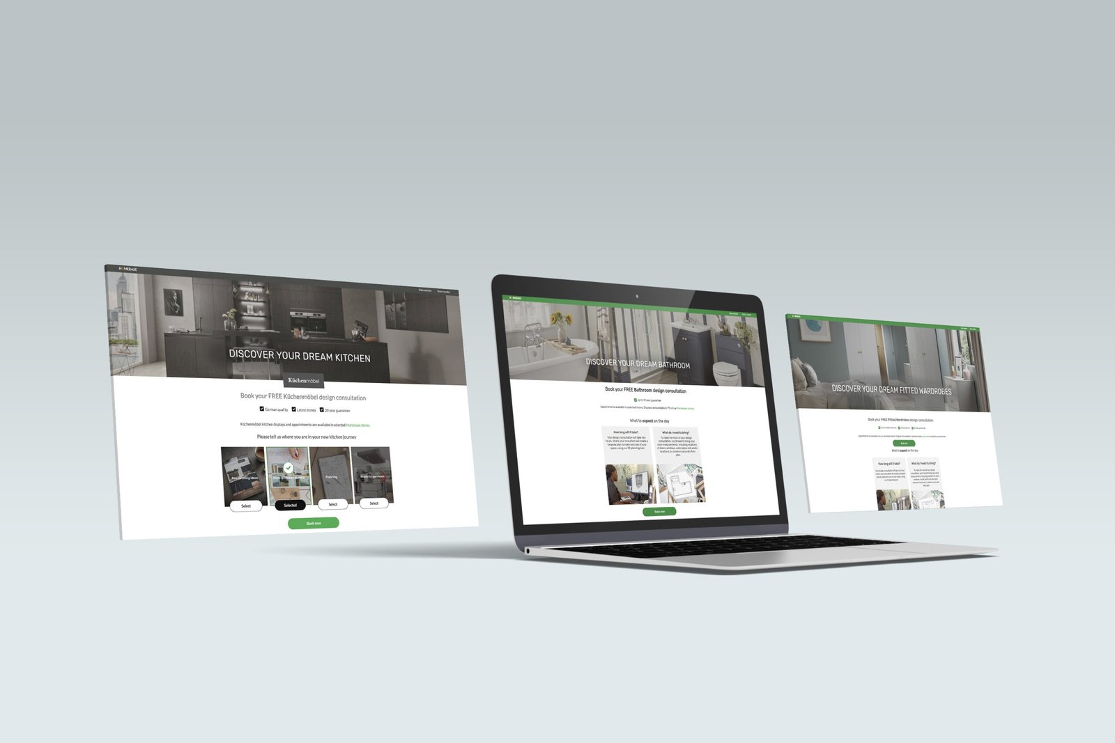
Kitchen Consultation form
For the Kuchenmobel consultation forms, I undertook the task of modernizing the pages while establishing a seamless connection between the Kuchenmobel brand and Homebase. Embracing creative freedom, I opted for sophisticated design elements, incorporating sleek visuals with a subtle yet contemporary flair. Utilizing elegant imagery overlaid with a dark palette, I aimed to evoke a sense of modernity and style, punctuated by strategic pops of color for emphasis and visual appeal.
Later I had to implement the same layout (to keep it all consistent) to the Wardrobe and Bathroom forms as they required rebranding and modernisation as well.