UX-UI DESIGN
Paint Colour
Finder
There was a need in helping customers find their perfect paint for their homes which is why we decided to create a tool that will do just that.

intro
In my capacity as the Head Designer, I’ve had a very active role n the creation of this innovative tool.
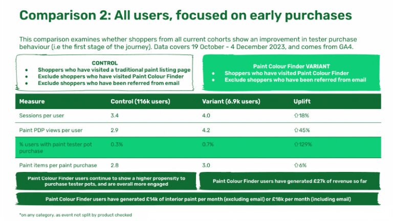
The implementation of the Paint Tool has proven equally impactful, generating an impressive £27,000 in revenue within the initial four weeks of its launch. Over £250k between 23rd October 2023 and March 2024. These results underscore my commitment to designing not only aesthetically pleasing but also commercially effective solutions.
about
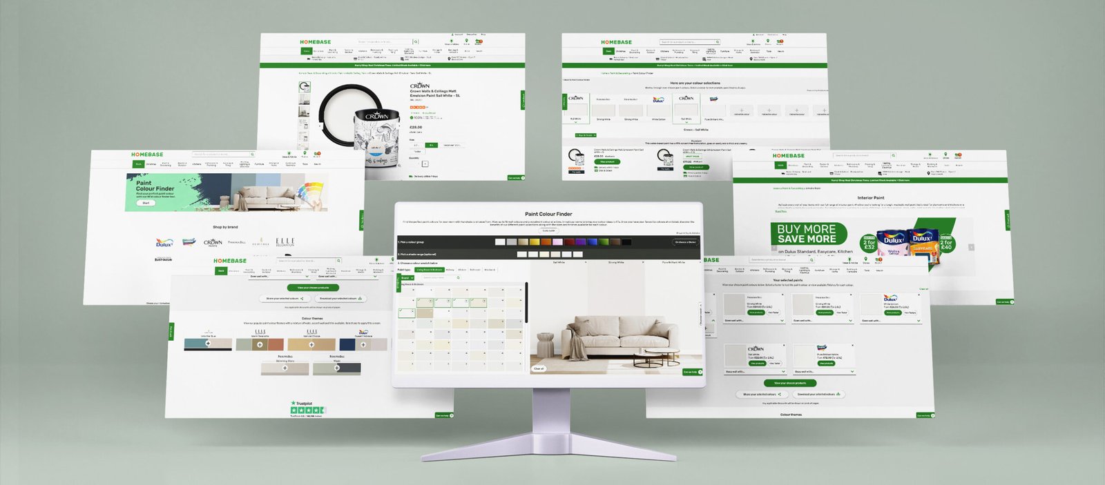
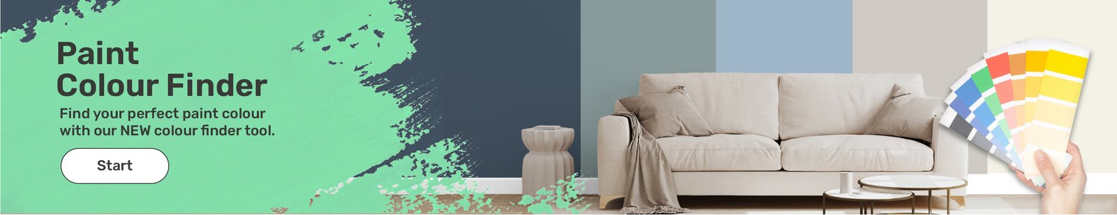
Introducing a groundbreaking addition to our website: a cutting-edge tool meticulously crafted to assist customers in selecting the perfect paint colors for their homes. This innovation is the result of extensive research and thoughtful design, ensuring not only unparalleled user-friendliness but also an aesthetic that radiates style and sophistication.
the impact
The impact of this groundbreaking tool is reflected in the data-driven success it has achieved.
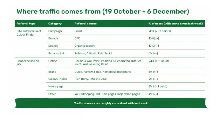
Remarkably, 20% of users who engaged with the Homebase email, featuring the paint tool, clicked through to explore the tool further. Impressively, 16% arrived at the paint tool page through Cost Per Click (CPC), with an additional 12% originating from organic search. Notably, a significant 24% were directed to the paint tool page by clicking on the strategically placed banner on the lister page for ceiling and wall paint.
first month
In the inaugural month, spanning from October 26th to 4th of December, an outstanding 21% of users who interacted with the paint tool went on to make paint purchases. The initial cohort utilizing the paint color finder has resulted in a substantial revenue of 5.5k specifically in interior paint sales. Significantly, this cohort’s conversion rate surpasses that of equivalent listings page shoppers, affirming the tool’s heightened value and efficacy in driving sales. This data underscores the resounding success of our innovative paint tool, setting a new standard for user engagement and commercial impact.
My UX process

UNDERSTAND
Concept evaluation
Competitive analysis
Contextual enquiries
Analytics review

RESEARCH
Competitor benchmarking
User testing & interviews
Diary studies
Focus groups
Heatmapping
Baymard articles & other research methods

ANALYSIS
User journey mapping
Affinity diagram
Mental models
Data analysis
Brainstorming sessions
Card sorting
Wireframes

DESIGN & PROTOTYPE
Low & High fidelity wireframes
Sketching
Low & High fidelity designs
Prototype
Validating with users
Handover to developers
Beta launch & testing
Final Launch
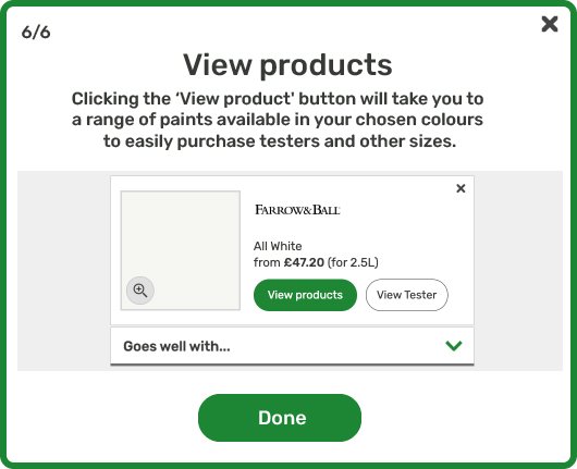
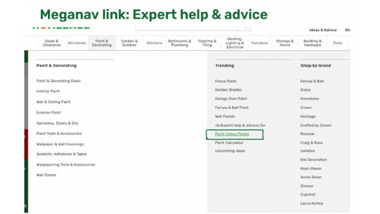
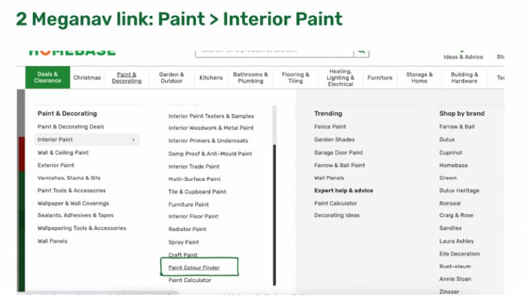
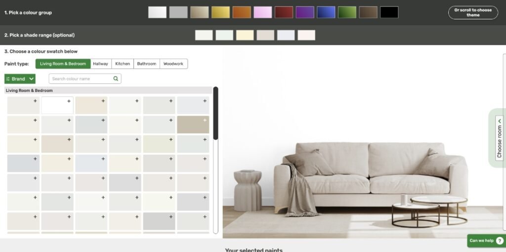
How to use the tool
Watch this presentation video and discover the Paint Tool.
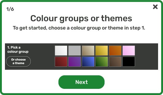
We have also inserted a Guide button that opens these pop ups for those who need help using the tool. This Guide explains in simple steps how to use the tool.
Scope based on business & stakeholder request
Create a Colour selector tool utilising products from the following categories:
Wall & Ceiling paint
Interior Wood paint
Kitchen Paint
Bathroom Paint
Wall paint & Trim paint
Filter options by size, brand and finish.
This needs to make the shopping easier to push conversion of paint sales.
Help people understand difference between the paint types .
Main users/target audience
Expert DYI-ers
Paint Begginers
Main shoppers were women aged around 40 years old based on the website insights.
Requirements
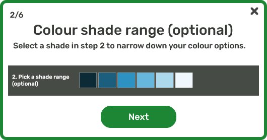
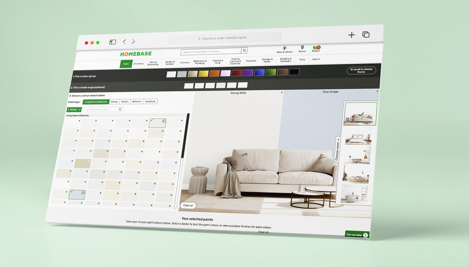
- Customer can use tool to select a colour group (default to neutrals) which will display all SKU colour variants for the ranges in scope (above).
- Customer has option to refine by shade (driven by AI) and/or brand filter.
Customer also has option to select the appropriate surface/room to further filter the results e.g. living, bathroom, kitchen, durable. - A tooltip or help flag will provide guidance to customers on selecting the right surface/room option above.
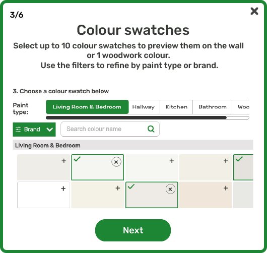
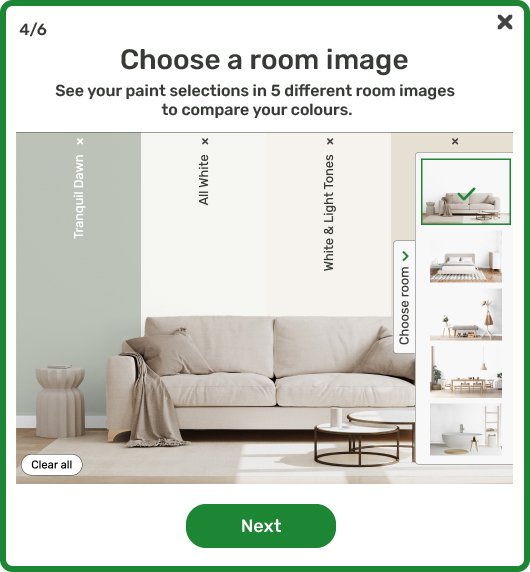
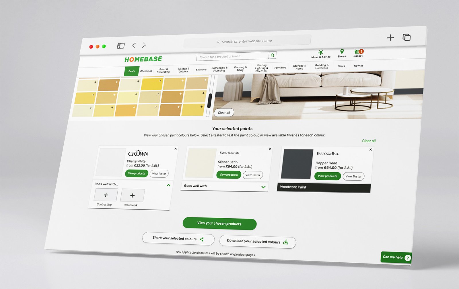
- Customer can select multiple paint swatches. The first 3 selected will be displayed in the visual image on walls 1, 2 and then the trim respectively.
- If a customer clears a colour using the cross buttons on a swatch or within the ‘selected paint summary’, then colour is removed from visual render and the next colour swatch chosen would replace this.
- On a selection of a 4th swatch then the customer is prompted on which zone they want to replace, 1, 2 or 3 – or alternative method to allow customers to switch between swatches in the preview window.
- Customer can move between different room sets with colours applied to each.
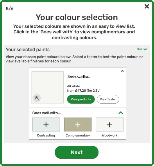
- For selected swatches, a list will be created beneath the visualiser element, ‘From price’ to be displayed, question if this should be tester or small pot cost? (check with commercial) – Use smallest tin price but not tester price
- Link to order tester where available for the selected swatches.
- Start over button to clear all colour selections.
- Colour swatches are scrollable horizontally or easy to navigate on mobile devices without loosing site of the visualiser element.
- Customer can continue to select colours (beyond the 3 that are shown) and their selected paint list will grow up to a maximum of 10? SKUs.
- Customers can click on a selected paint magnifying icon to see a larger swatch.
- AI driven ‘pairs with’ capability to recommend up to 3 co-ordinating colours – need to define the logic used e.g. complimentary, shades etc – can we use AI driven suggestions by default but override if we have data from suppliers
- Touch zones on mobile should be at least 44px square whenever possible
Selecting a colour group will scroll the page so that the main image and top row of swatches are in viewport. - After customers have selected paint swatches, how do we make it clear they need to scroll to see their selected paints.
- Can we show some ‘trending paint theme’ at the bottom of the page for inspiration that could be applied to the image.
Risks & Qyestions
Customers could apply trim paint to walls or vice versa (filters may help to mitigate this but do we have any other controls?)-yes the trim paint and wall paint label( Homebase dark grey to stand out)
Filters for kitchen/bathroom will help customers to choose the right paint for their room but users could still apply standard paints to bathrooms/kitchens which we shouldn’t disallow.
Colour swatch flow ordering is powered by AI, how harmonious can we make the flow compared to the colour walls we present in store.
If a customer clicks to a list of products, then clicks back then all selections are lost, can we prevent this? Yes, the selections will remain if you go back. Open in a new window? or can we use Cookies to retain the colour selection? yes
Whats the maximum number of paints a customer can select?
What algorithm will drive the ‘pairs with’ capability?
If a customer selects a kitchen/bathroom images, can we display a message to say we recommend choosing kitchen/bathroom paint?
Lister
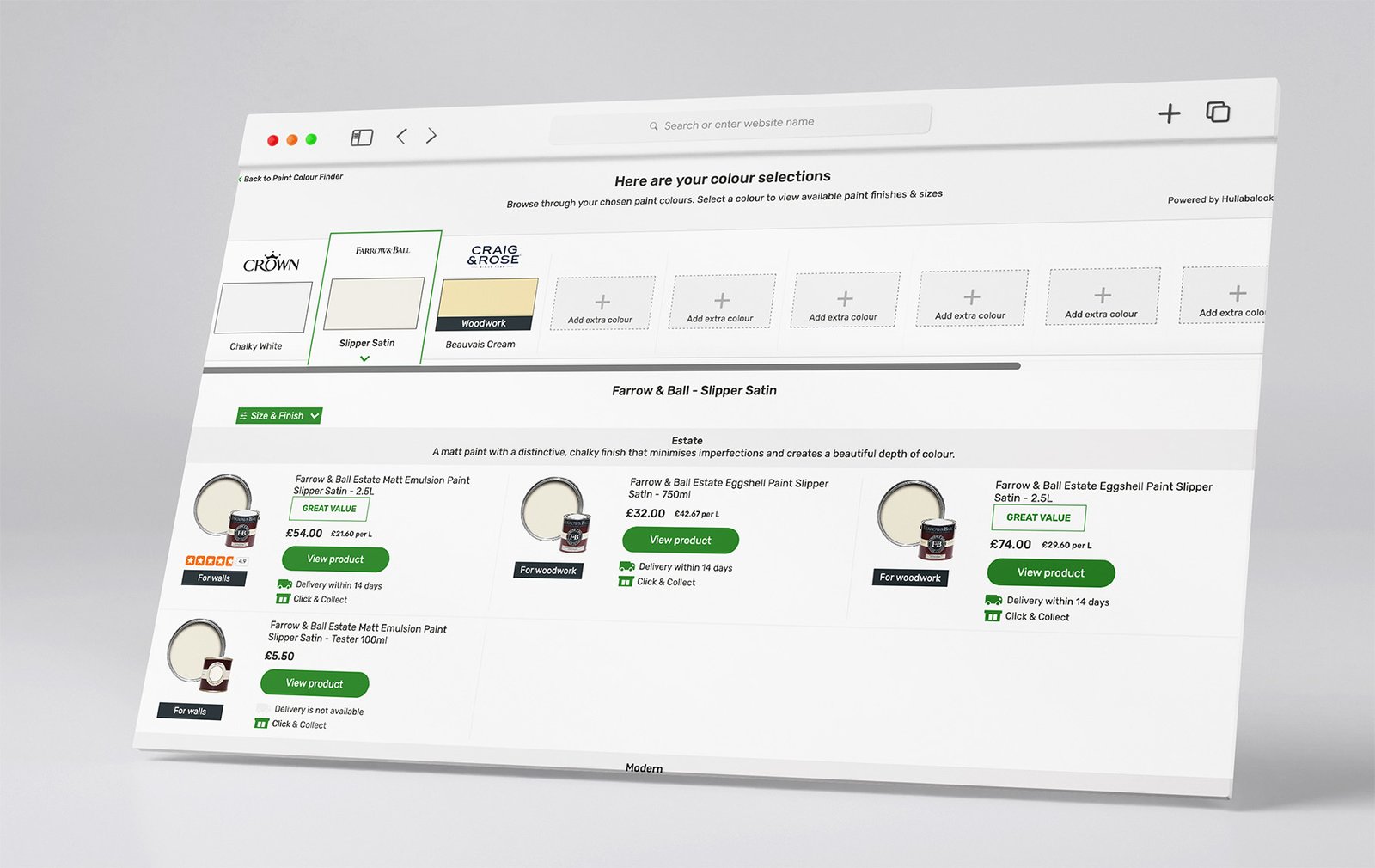
Shop finishes button will take customer a list of products available in that colour/brand
If this page is powered by hullabalook could we display the products in a particular order? maybe by size, or group the finishes together perhaps?
Customer can use filters to refine finish, size, brand, range etc.
Products will link to respective PDPs on homebase.co.uk
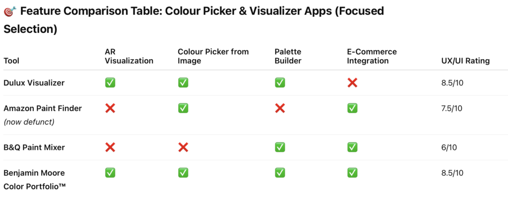
Benchmarking Analysis: UX/UI Design of Colour Tools
To inform the UX/UI strategy for the Paint Tool at Homebase, I conducted competitive benchmarking of key digital tools that offer colour selection and visualization functionalities. These included:
Dulux Visualizer App
Amazon AR View & Paint finder
B&Q Paint Mixer
Benjamin Moore Color Portfolio™ App
Each tool was evaluated across core UX metrics: usability, interactivity, interface clarity, personalisation, and conversion support.
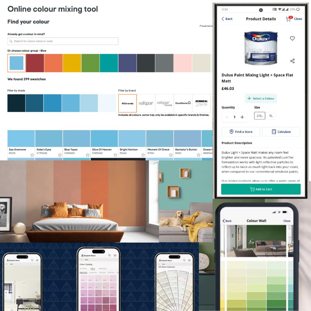
Dulux Visualizer App
Strengths:
Augmented Reality (AR) visualization of paint colours directly on walls.
Ability to snap and match colours from real-world elements.
Clean UI with intuitive tap-to-paint interaction.
Encourages exploration with palette suggestions.
UX Opportunities for Homebase:
Introduce a virtual try-on mode for paint using photo or AR input.
Use a visual-first layout that supports confidence in decision-making.
Amazon Paint finder & AR View
Strengths:
Seamless integration of colour options during product exploration (e.g., furniture, decor).
Consistent UI components across devices.
Immediate visual feedback as colour options are selected.
UX Opportunities for Homebase:
Live preview of paint colours on a room image.
Stand out CTA buttons (“Add to basket”, “Save palette”) to reduce friction.
Smooth transitions between browsing and configuration.
B&Q Paint Mixer
Strengths:
Allows users to create custom shades with a real-time preview.
Uses sliders and colour wheels for detailed adjustments.
Integration with online shopping for purchase.
Weaknesses:
Interface feels utilitarian and less visual.
Small tap targets and underwhelming mobile layout.
UX Opportunities for Homebase:
Combine precision input with a more immersive and engaging interface.
Offer guided workflows (e.g., “Find the right colour for your kitchen”).
Benjamin Moore Color Portfolio™
Strengths:
Modern, minimal aesthetic with focus on sample previews.
Colour history tracking and bookmarking.
AR-powered visualization and colour extraction.
UX Opportunities for Homebase:
Catalogs to see similar colours
Allow users to save and share colour projects.
Research & Analysis
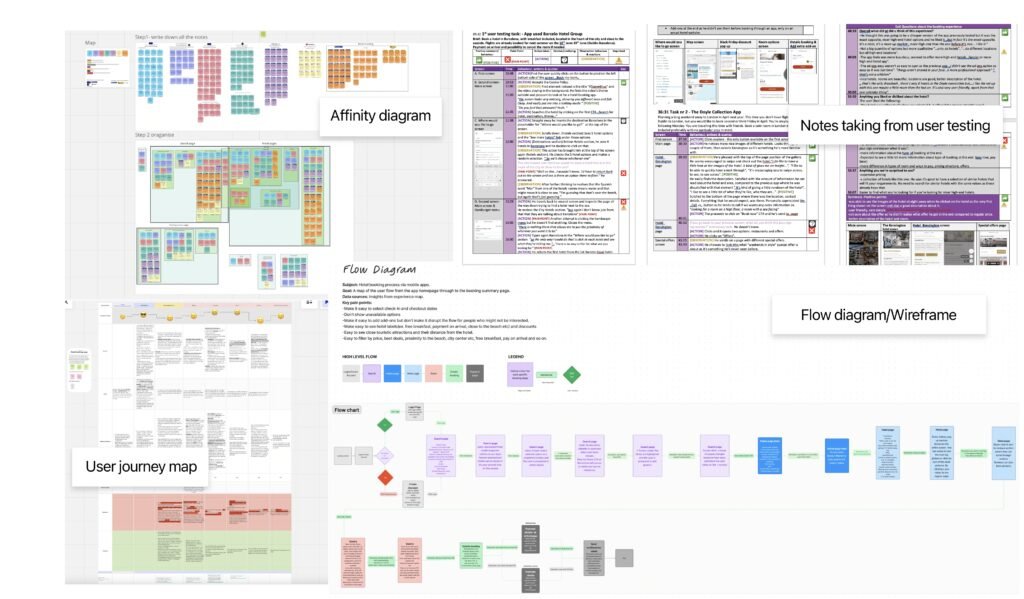
1. User Interviews & Notes
Purpose:
To gather direct, qualitative insights from real users about their expectations, frustrations, and preferences.
Process:
Conducted structured or semi-structured interviews.
Captured findings in a task-by-task breakdown.
Logged quotes, reactions, and behavioral cues.
Tracked pain points using visual indicators (e.g., thumbs down or issue markers).
Outcome:
This helped identify key usability bottlenecks and unmet needs that guided the design priorities.
2. Affinity Diagramming
Purpose:
To synthesize raw interview data into actionable themes.
Process:
Step 1: Captured all observations and quotes as sticky notes.
Step 2: Grouped similar notes into clusters based on behavior or problem types.
Color-coded notes helped distinguish between types of insights (e.g., feature requests, usability issues, emotional reactions).
Outcome:
This technique revealed overarching patterns like:
Common friction points in the paint selection process.
Mental models users have about visualizing colour.
3. User Journey Mapping
Purpose:
To visualize the end-to-end experience users go through with the paint tool.
Process:
Created a horizontal map of stages (e.g., Discover → Select → Preview → Purchase).
Annotated with:
User goals at each stage.
Actions taken.
Pain points and emotions (often color-coded).
Opportunities for improvement.
Outcome:
This map highlighted gaps in the user experience and opportunities to enhance the paint selection journey—for instance, a need to better support visualizing in context.
4. User Flows & Wireframes
Purpose:
To define the structure and logic of user interactions.
Process:
Mapped high-level flows (e.g., from homepage to checkout).
Defined conditional paths (e.g., logged-in vs guest, mobile vs desktop).
Illustrated interaction models using a flow chart format.
Created low-fidelity wireframes to visualize key screens (e.g., colour mixer, preview, product page).
Outcome:
This stage established how users could move efficiently through the interface while keeping decision-making clear and friction low.
5. Card Sorting
Purpose:
To uncover how to group and label information.
Process:
Me & the stakeholders used Miro to do card sorting. Then proceed to group cards representing paint types, finishes, tools, or categories.
Group them in ways that made sense to us.
Often followed up the stakeholders with questions like “Why did you put these together?”
- Also used this technique to organise the affinity diagram observations for more clarity.
Outcome:
Informed the navigation structure and taxonomy—how the paint products were categorized and labeled for easy discoverability.
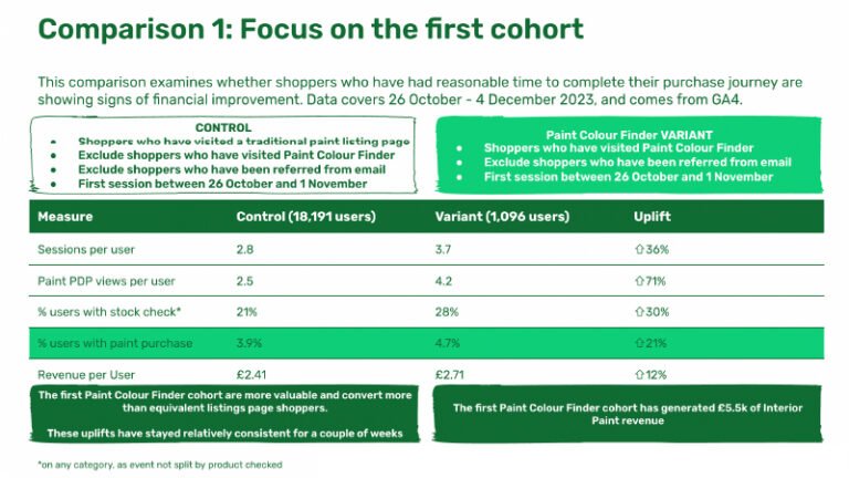
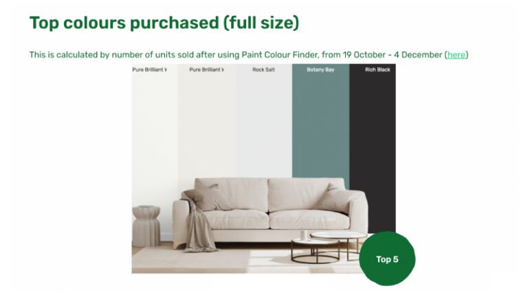
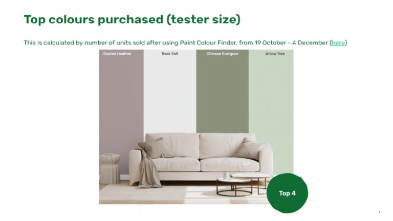
Results: Focus on the first cohort
Main Points
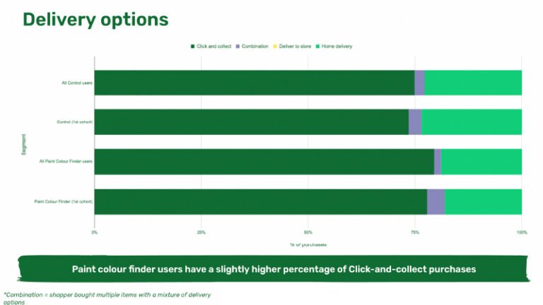
In the inaugural month, spanning from October 26th to 1st of December, an outstanding 21% of users who interacted with the paint tool went on to make paint purchases. The initial cohort utilizing the paint color finder has resulted in a substantial revenue of 5.5k specifically in interior paint sales. Significantly, this cohort’s conversion rate surpasses that of equivalent listings page shoppers, affirming the tool’s heightened value and efficacy in driving sales. Paint colour finder users have a slightly higher percentage of Click-and-collect purchases. Users continue to show a higher propensity to purchase tester pots, and are overall more engaged.
Paint Colour Finder users have generated £14k of interior paint per month (excluding email) or £18k per month (including email) with a total of £27k. Over £250k between 23rd October 2023 and March 2024
This data underscores the resounding success of our innovative paint tool, setting a new standard for user engagement and commercial impact.
More details about the tool
First section
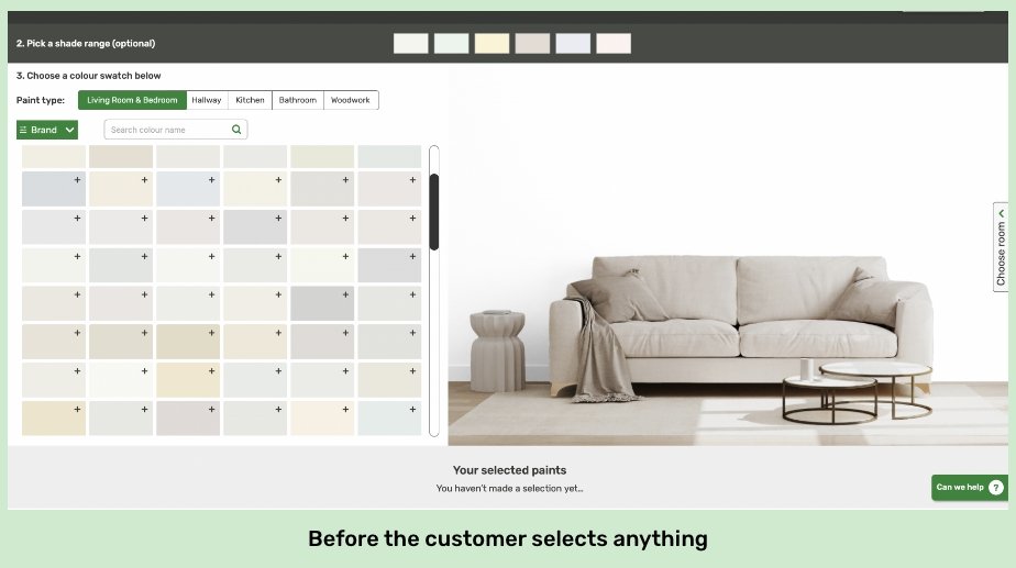
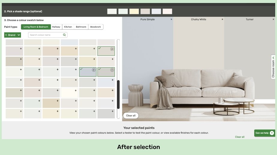
Here you can pick your colours, brand, paint type based on room and even change the background image by clicking on Choose Room.
You can easily compare colours between them by selecting them and viewing them on the wall of the room chosen.
Benchmarking done on competitors such as Amazon colour picker, Dulux Visualiser App, PPG Paints and other similar companies.
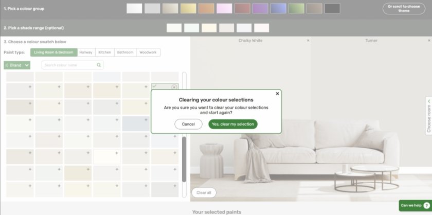
Ways to clear the colour selections and why
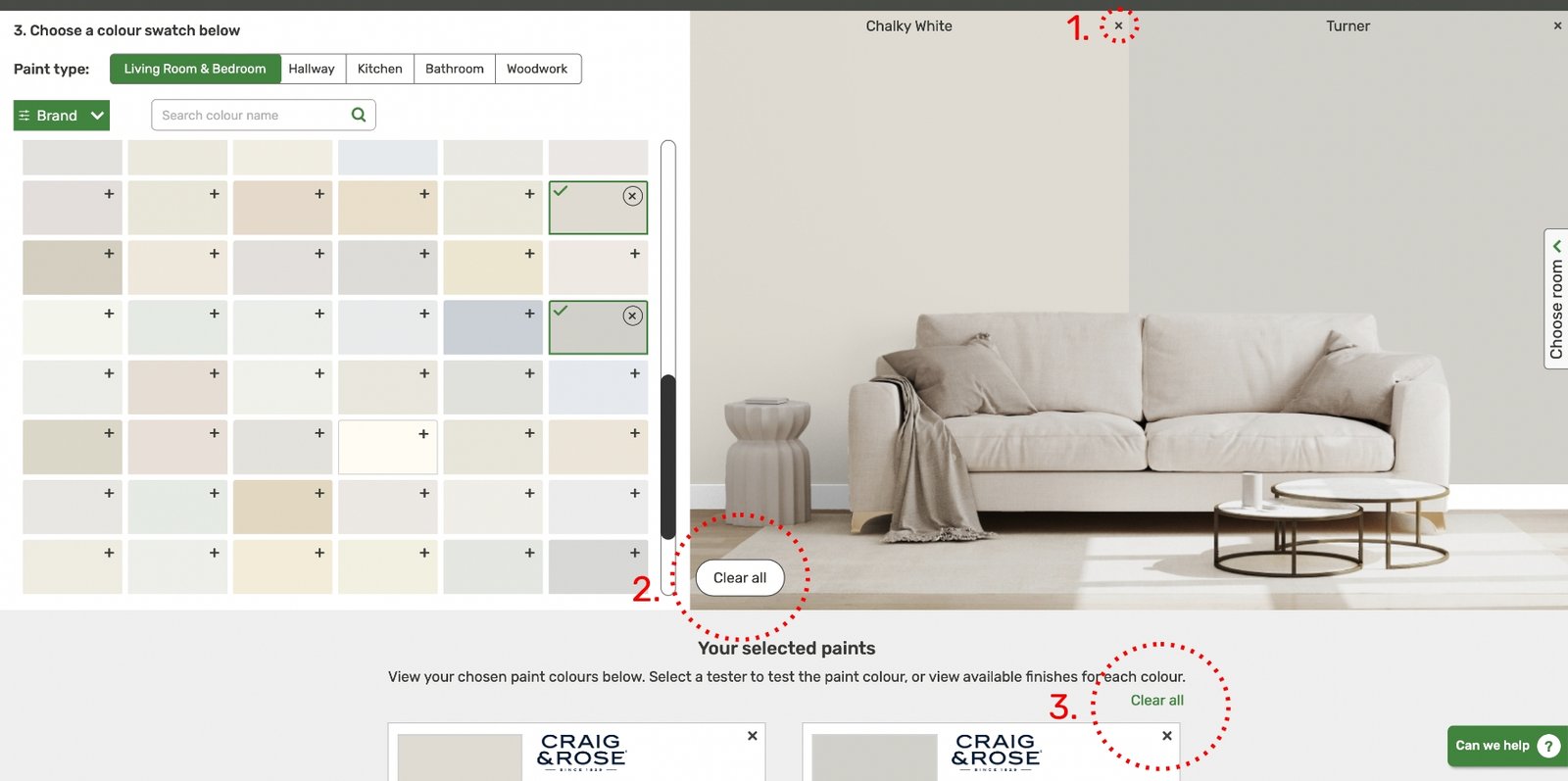
1. Erase one colour at a time
2. Erase all Colours from the room image
3. erase all colours from the Selected Paints section
By clicking on the X icon you can erase only one colour at a time from the wall.
This is the most clear CTA for erasing all the colours selected so far. It can be easily seen when you are on this screen in case you are missed from the section bellow.
The smaller Clear all button in the your selected paints is here in case people want to erase everything from this section and missed the button from from the section above.
Forgiveness design rule
Designing for forgiveness means creating products that are forgiving of human error. It involves anticipating mistakes users may make and incorporating features that minimize their negative impact. By designing for forgiveness, products can be more user-friendly and ultimately lead to greater user satisfaction.
Challenge
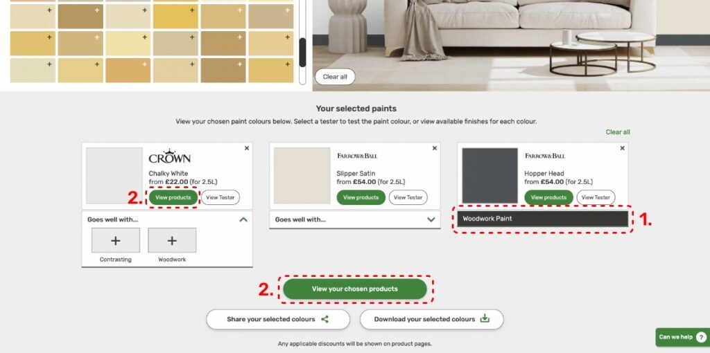
1. How to see the difference between wall paint & trim paint
Solution: Visually differentiate the two and name the one that is a woodwork paint.
Why just one? Because it is more common to buy multiple wall paints and one woodwork paint.
2.How to make it clear for customers what to click on to go to the next stage?
Solution: Make the main CTA more proemininent ex. Colour green to stand out and place it first.
Weather you click on the individual view products or the bigger view chosen products you are still being lead to the next page, the only difference being that if you click specifically on one of the paints that is the one that will show as first on the next page.
Fitt's design rule
It is faster to reach bigger targets that are close to you than it is to hit smaller ones that are further from to you
– view your chosen products CTA
– trying to help you go to the next step
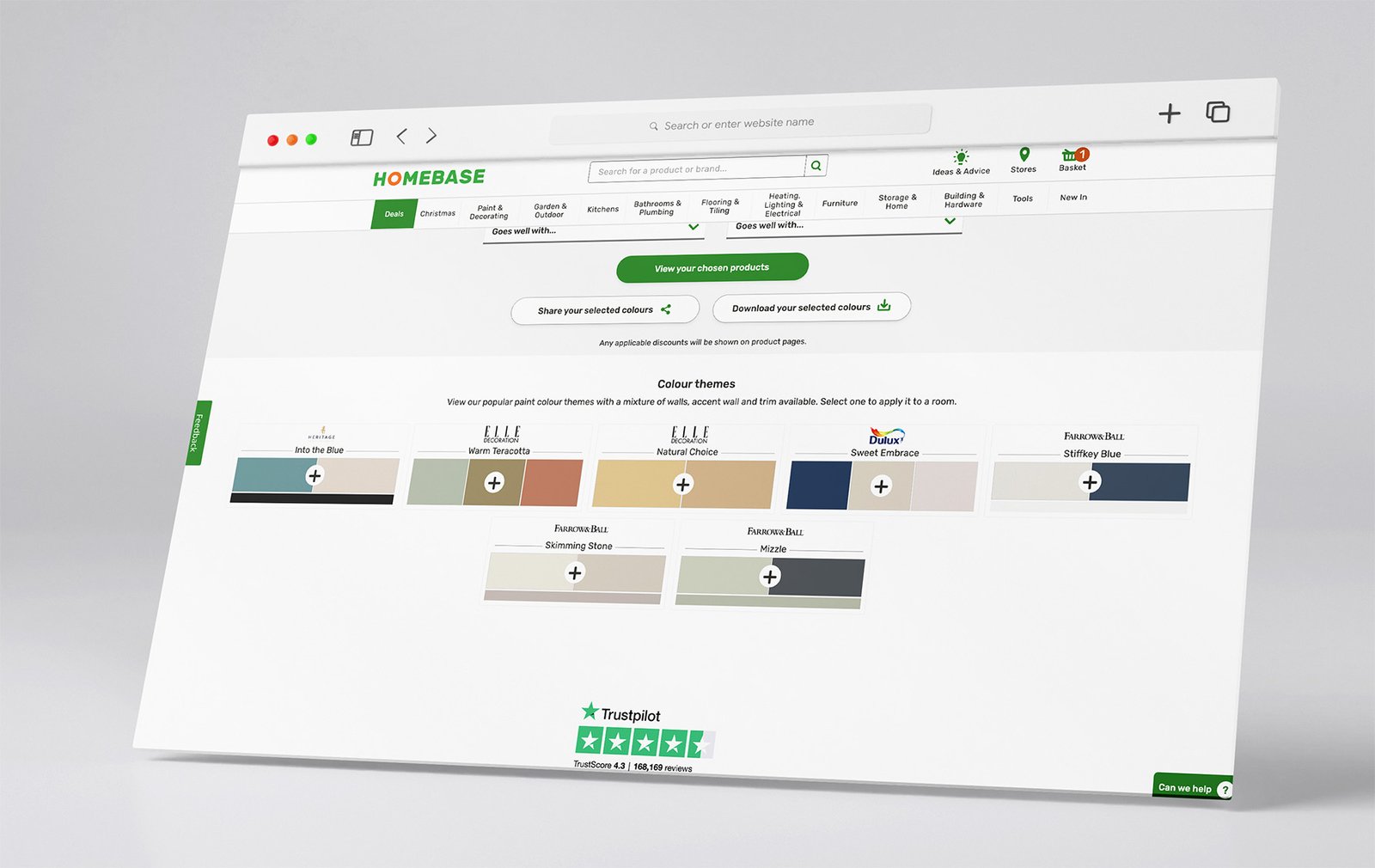
About Colour themes
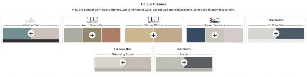
Sweet embrace continues to be the most selected theme – significantly ahead of the others.
2. Colour selection page
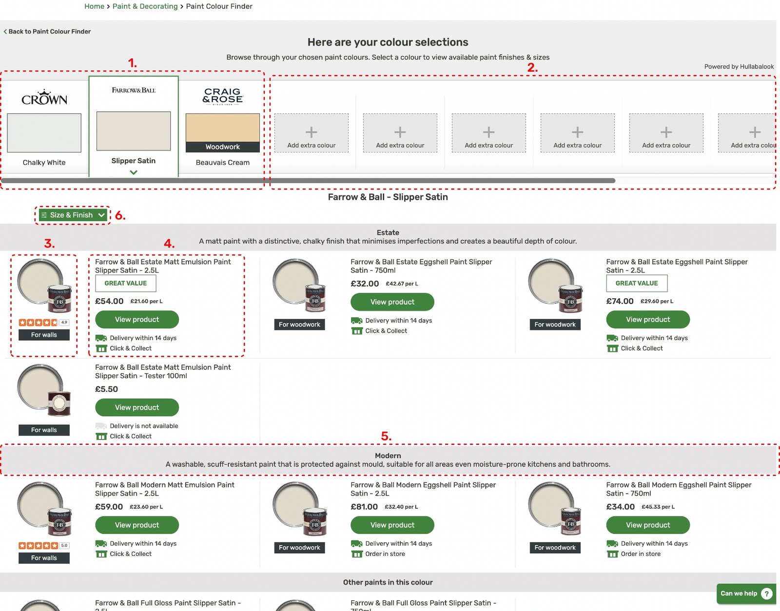
1.
Selected colours section
These are the selected colours tiles. The idea came from a folder but implemented in a digital way to easily swipe through the colours.
2.
Add extra colour section
Here you can add extra colours by clicking on the + icon. The user will be send to the previous page to add extra colours.
3.
Product img, reviews & tags
Lorem ipsum dolor sit amet, consectetur adipiscing elit. Ut elit tellus, luctus nec ullamcorper mattis, pulvinar dapibus leo.
4.
Product details
.Product detailLorem ipsum dolor sit amet, consectetur adipiscing elit. Ut elit tellus, luctus nec ullamcorper mattis, pulvinar dapibus leo.
5.
Paint Finish
Lorem ipsum dolor sit amet, consectetur adipiscing elit. Ut elit tellus, luctus nec ullamcorper mattis, pulvinar dapibus leo.
6.
Paint Filter
Lorem ipsum dolor sit amet, consectetur adipiscing elit. Ut elit tellus, luctus nec ullamcorper mattis, pulvinar dapibus leo.
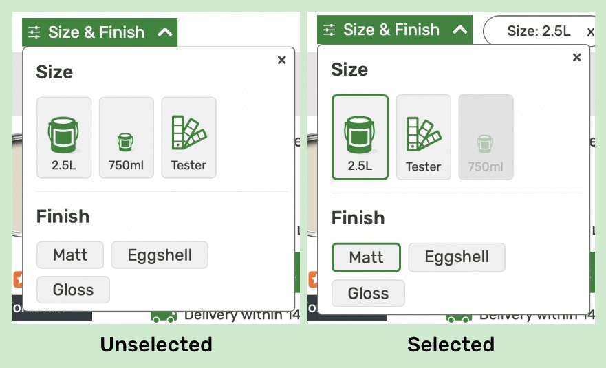
Paint Finish & Size Filter
Here we can see the difference in the finishes and sizes between products.
Whichever one you choose to click on will send you to the Product page.
By putting the type of finish in a grey rectangle helps divide the paints between them and makes it stand out to the customer.
You can also narrow your scope by filtering using our size & finish filter which I think it’s very helpful.
Banners for various brands on the Homebase website


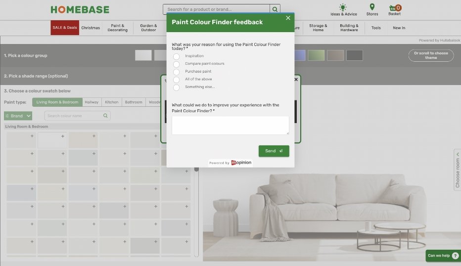
Feedback Form
The feedback form is to give continuous & constant feedback from the customers as a design job is never truly done and it can always be improved.