UX-UI & Brand refresh
Category pages
& PDP pages
Since joining Homebase I have worked on many positive changes & modernisation across the entire website. Below I will show a few examples.


PDP-Image creative showing the inside
Need: To show the inside & inside colour of the wardrobe on a PDP and a Lister page. Design needs to work for both.
Challenges: Limiting space, small image, be aware of the Heart icons on the top right corner of the image and the left and right arrows on the PDP page. Text & visual in general has to be visible & readable both on the Lister page and PDP.
Solution: Graphic image showing both the wardrobe and the inside with the right notes on it making it very clear what it is presenting without overcomplicating it.
Design made based on the problems explained above.
Result 7% more sales as the shopping journey is much easier & customer friendly.
Wardrobe Lister Pages
Need: To show the inside & inside colour of the wardrobe on a Lister page.
Problem: Limiting space, small image, be aware of the Heart icons on the top right corner of the image and the left and right arrows on the PDP page.
Solution: Graphic image showing both the wardrobe and the inside with the right notes on it making it very clear what it is presenting without overcomplicating it.
Design made based on the problems explained above.
Result 7% more sales as the shopping journey is much easier & customer friendly
Wardrobe features icons
Objective: To effectively communicate the unique features of the wardrobe in a visually engaging manner, distinguishing it from competitors.
Approach: Utilize flat design principles and intuitive icons to ensure easy comprehension for users. Maintain prominent brand visibility to prevent any ambiguity.
Challenges: Intuitive icons, be aware of the space (arrows left right, magnifying glass icon, readable text).
Result: By employing these strategies, the wardrobe’s distinctive attributes are showcased clearly and attractively, enhancing user understanding and brand recognition.
Flooring features icons
Objective: To effectively communicate the unique features of the flooring in a visually engaging manner, distinguishing it from competitors.
Approach: Utilize flat design principles and intuitive icons to ensure easy comprehension for users. Maintain prominent brand visibility to prevent any ambiguity.
Challenges: Intuitive icons, be aware of the space (arrows left right, magnifying glass icon, readable text).
Result: By employing these strategies, the flooring’s distinctive attributes are showcased clearly and attractively, enhancing user understanding and brand recognition.

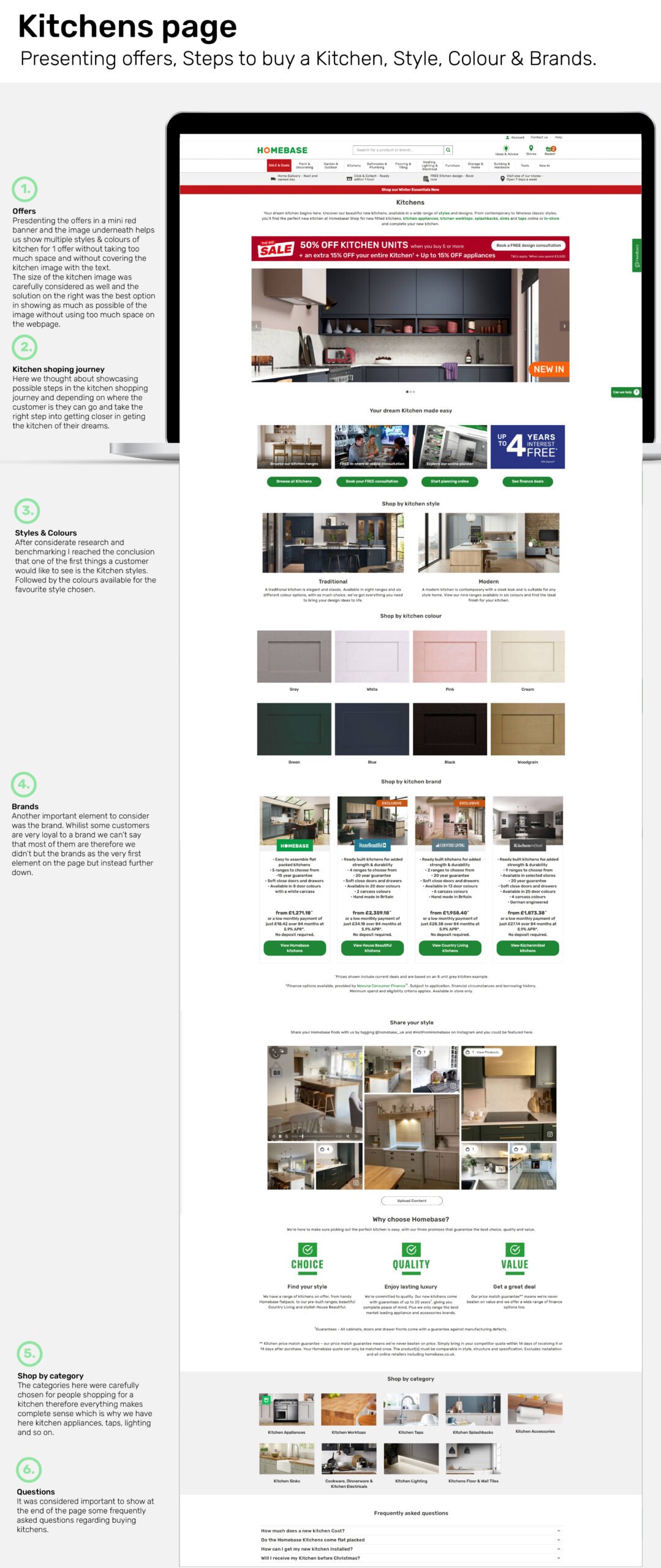
Latest Deals & Popular categories-Homepage
In the context of redesigning Homebase’s homepage, the concept of minimalism and user-centric design takes center stage. I aimed to strategically integrate key deals and categories into the layout while prioritizing seamless user navigation.
By carefully selecting and featuring essential categories like “NEW products” and seasonal offerings such as “Winter Essentials” and “Christmas,” I ensured easy access and relevance for users. Moreover, with Homebase boasting a vast array of categories, streamlining to 12 primary ones on the homepage while offering additional options in the menu optimizes user experience.
This approach not only maximizes space efficiency but also enhances user engagement by aligning with their shopping preferences and flow.

Traditional Kitchen Ranges
In optimizing the user experience for the kitchen page, I proposed a solution tailored to Homebase’s diverse range of kitchen types and their extensive selection of ranges. By prominently featuring representative images alongside clear and compelling calls-to-action (CTAs) on both the Traditional and Modern pages, customers are provided with an intuitive pathway to select their preferred kitchen style. This approach streamlines the decision-making process, enhancing user engagement and satisfaction.

Lister Page -View Deals top section
Objective: To incorporate a deals section on the webpage without overwhelming the layout with excessive content, ensuring a seamless user experience.
Approach: Implemented simple text CTAs leading to respective categories, strategically positioned at the top of the Lister page for immediate visibility without disrupting user navigation.
Result: The minimalist text CTAs effectively highlight deals while maintaining a clean layout, enabling users to explore categories seamlessly from the outset of their journey.
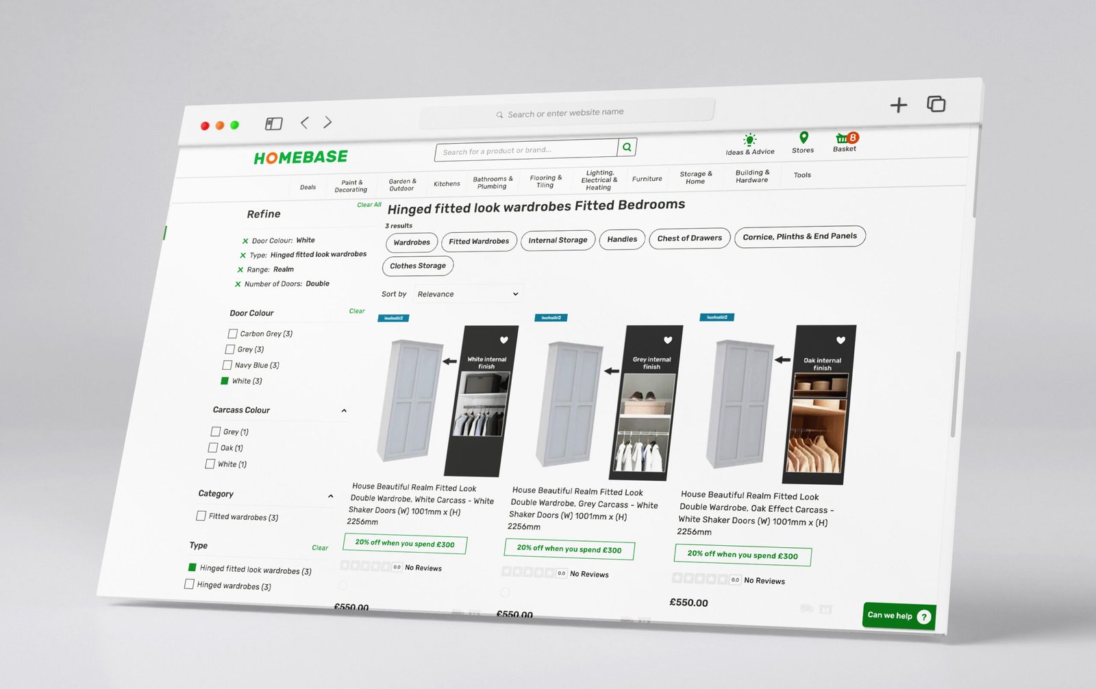
Other page elements I worked on: Filter section, heart element, product labels (clearance etc)

Sofa features visual-PDP
Objective: To visually present Homebase’s new flat-packed couch, including dimensions and delivery information, in a manner that aligns with the brand’s aesthetic and ensures ease of understanding.
Approach: Created a graphic visual showcasing the couch with clear dimensions and incorporated delivery details (3 days) while adhering to Homebase’s brand guidelines to maintain consistency.
Result: The visually appealing graphic effectively communicates the features of the new couch, including dimensions and delivery information, in a way that resonates with the brand identity and is easily comprehensible for customers. Therefore more sofa’s have been sold.
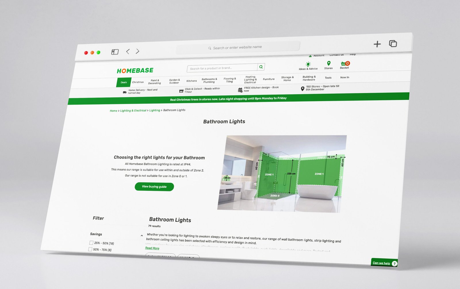
Bathroom lights placement guide

Flat packed couch guide & measurements

Hirestation page on the Homepage website

PDP page
scenario B
Many customer images uploaded
Powered By EmbedPress
Powered By EmbedPress
PDP page
scenario A
No customer images uploaded
Mobile size
Main points to go here
Desktop size
Main points to go here
Powered By EmbedPress
Powered By EmbedPress