UX-UI DESIGN (APP & SaaS DASHBOARD) + BRANDING + ANIMATION + PRINT
Virtue Health
UX UI design
At the startup, I thrived in a fast-paced environment where I frequently wore many hats. As the only designer of the team, I contributed to projects including the development of a medical dashboard, app design, website creation and redesign, visual design, social media graphics, GIF production, illustration, and brand development.
Page is not 100% done but hopefully it should give you some insight into the work I developed for Virtue…
intro & about
In my capacity as the Head Designer, I’ve had a very active role in the creation of the medical dashboard, patient app design, brand creation, website design, print assets and social media assets.
My Impact on the Design Ecosystem
I have played a pivotal role in shaping the visual and user experience identity of Virtue Health, ensuring consistency across digital, print, and product design.
- UX & App Development – Crafted wireframes, app designs, and user flows, implementing best UX practices for usability and accessibility.
- Medical SaaS Dashboard & UX Optimization – Designed and refined the Medical Dashboard, collaborating with medical consultants to ensure it meets industry standards and allows clinicians to effortlessly onboard patients, create care plans, and manage scheduling.
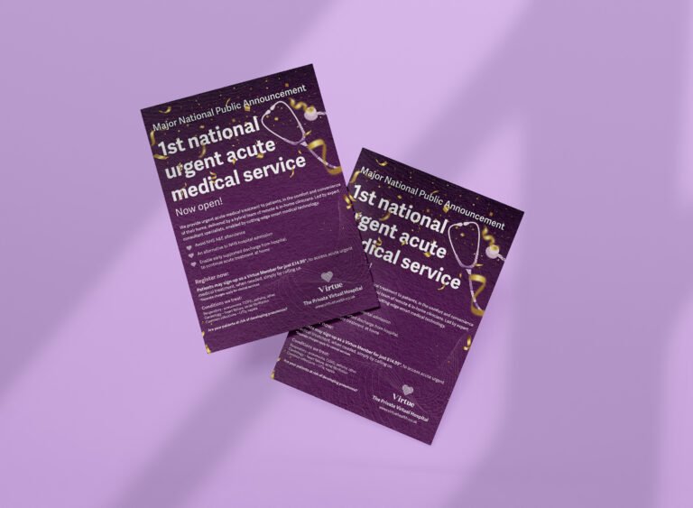
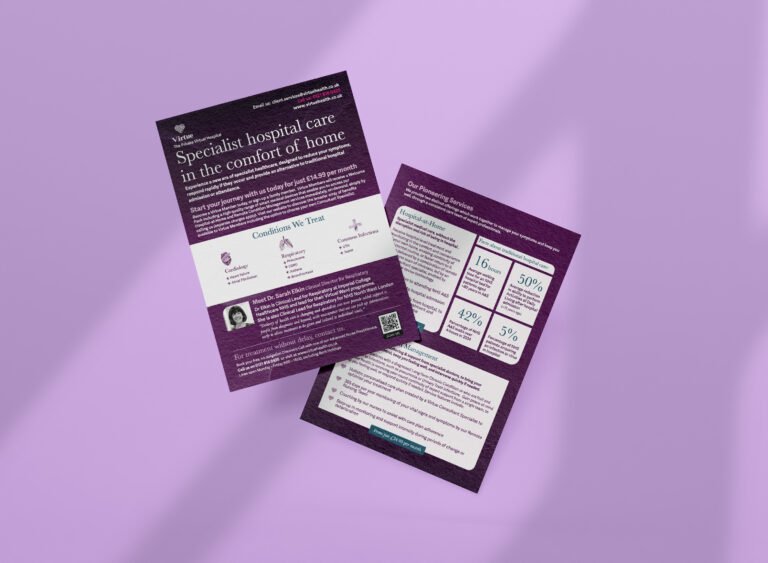
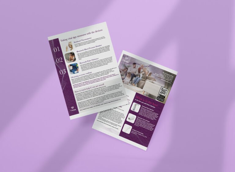
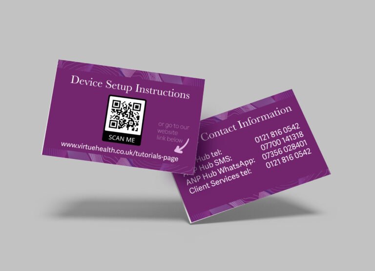
- Brand & Marketing Design – Created engaging social media graphics, GIFs for advertising, flyers, print materials, and large event banners, enhancing Virtue Health’s visibility and outreach.
- Product & Packaging – Designed a custom box for medical devices, ensuring a professional and branded unboxing experience.
- Web & Digital Presence – Led web design in Figma, built the website in Squarespace, and ensured a seamless digital user experience.
In instances where the owner’s feedback conflicted with established UX/UI best practices, I ultimately had to proceed with certain decisions I did not fully endorse.
- Vendor Sourcing & Negotiation – Identified and negotiated with companies to optimize costs and secure high-quality materials and services.
- Multimedia & Video Production – Edited videos and designed dynamic content to amplify Virtue Health’s storytelling.
Through my end-to-end design leadership, I have significantly enhanced Virtue Health’s brand, user experience, and operational efficiency, making it more accessible, visually compelling, and clinician-friendly
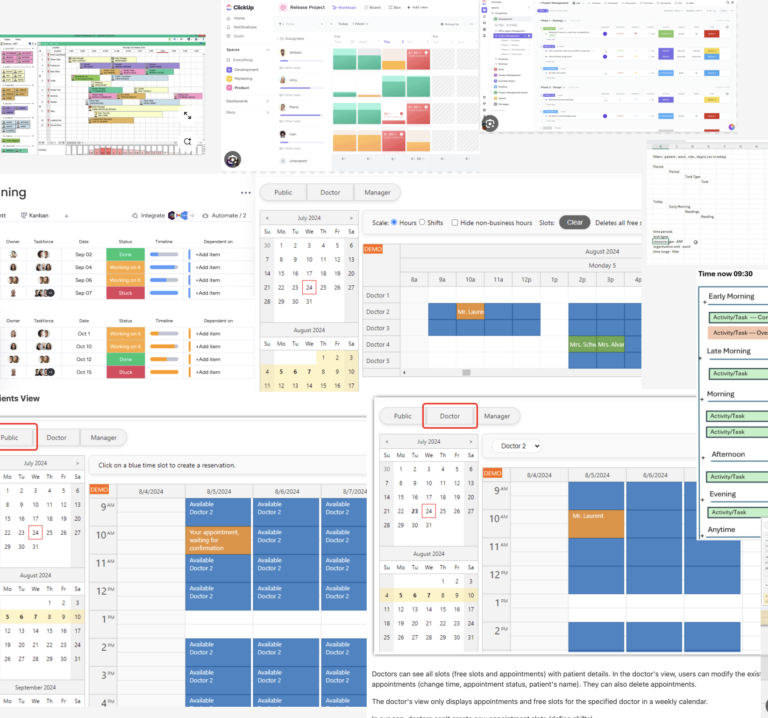
The Virtue Dashboard
Spearheaded the complete design lifecycle of a sophisticated clinical dashboard, enabling nurses and clinicians to seamlessly onboard patients, monitor real-time vitals, develop customized care plans, log detailed medical notes, and manage scheduling.
By implementing a clinitians user-centric approach, the platform significantly streamlined clinical workflows and improved patient outcomes.
Since Virtue Health’s Medical Dashboard follows a patient-pays model, its positioning as a SaaS product should focus on value to patients, scalability, and competitive differentiation.
Dashboard-The impact
At first we had an overcomplicated and chuncky dashboard using elements from the NHS brand. We stripped it all and started adding elements for the MVP stage (only the main features) and then started adding the more advanced features while maintaining the user-friendliness.
Virtue Health’s Medical Dashboard has transformed the way clinicians manage patient care, offering an intuitive, user-friendly platform that streamlines workflows while improving patient outcomes.
Effortless Patient Onboarding – Clinicians can quickly enroll patients, reducing administrative burdens and ensuring seamless intake.
Customizable Care Plans – Healthcare providers can develop personalized treatment plans, tailored to individual patient needs with just a few clicks.
Real-Time Monitoring & Insights – The platform enables live tracking of vitals, empowering clinicians to make data-driven decisions faster.
Simplified Scheduling & Task Management – Appointments, follow-ups, and care coordination are handled in one centralized hub, minimizing errors and inefficiencies.
Clinician-Centric Design – With an intuitive UI, healthcare professionals can focus on patient care instead of struggling with technology.
By eliminating complexity and enhancing accessibility, the dashboard has streamlined clinical operations, improved patient engagement, and allowed providers to deliver high-quality care more efficiently.
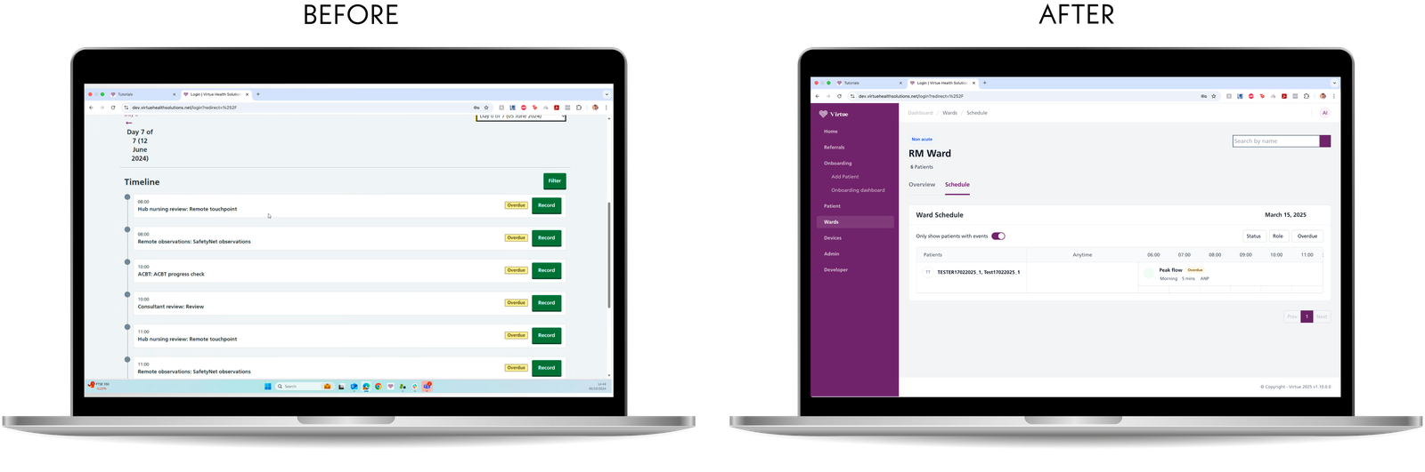
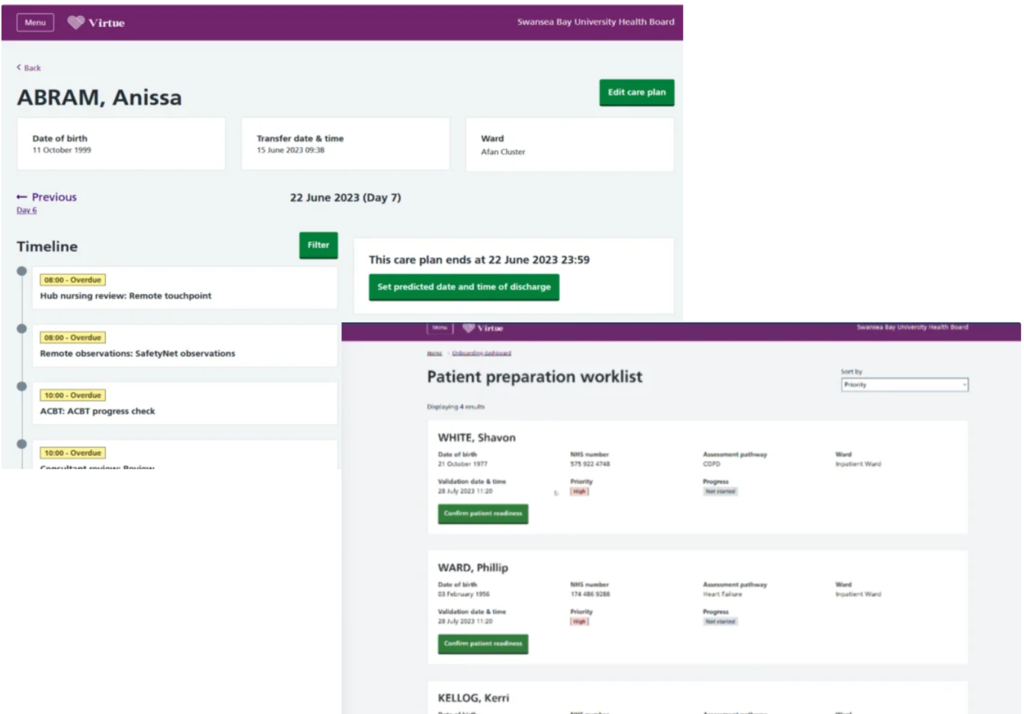
BEFORE: UX/UI Issues in the Old Ward Schedule Screen
Cluttered, List-Based Layout
- The original design used a long vertical list for scheduling, making it difficult to scan and navigate.
- Clinicians had to scroll extensively to find relevant tasks.
- There was no clear structure to differentiate between tasks or time slots.
Lack of Filtering & Prioritization Options
- No way to filter tasks based on status, urgency, or role, forcing clinicians to manually sift through the entire list. Only filter by newest to oldest.
Minimal Time Management Support
- Repetitive chunky button serving the same purpose
- Tasks lacked contextual grouping by time slots, making it hard to track morning vs. afternoon assignments.
Unstructured Patient List & Task Allocation
Poor Readability & Navigation
- The page had minimal hierarchy, making it difficult to scan quickly.
- Text-heavy interface with small, condensed buttons that didn’t stand out.
- No left-side navigation panel, forcing users to rely on multiple clicks to access other features.
AFTER: Key UX/UI Improvements in the New Ward Schedule Screen
Intuitive, Calendar-Like Layout for Better Organization
- Inspired by Microsoft Calendar, the new grid-based time table provides a structured, easy-to-read overview.
- Tasks are now aligned with time slots, allowing for faster scanning and better planning.
Eliminates the need for excessive scrolling, as tasks are visually grouped by time.
Smart Filtering for Faster Task Management
- Added filters for Status, Role, and Overdue Tasks, allowing clinicians to:
- Focus only on urgent or pending tasks.
- View only tasks relevant to their specific role (e.g., nurse, consultant).
- Quickly find overdue assignments to prevent delays in patient care.
Patient List Organized for Quick Access
✔ Patients are now listed separately from tasks, ensuring clearer navigation.
✔ Added a toggle option to show only patients with scheduled events, reducing clutter.
✔ Each patient’s schedule is now grouped together, preventing information overload.
Structured time grid
- Tasks are now displayed horizontally within a structured time grid, making it easier to:
- Differentiate between morning, afternoon, and evening tasks.
- Identify potential schedule conflicts at a glance.
- Overdue tasks are clearly highlighted in color, ensuring they are immediately noticeable.
Cleaner UI with Enhanced Readability
✔ Consistent typography & spacing improve text legibility.
✔ Use of white space prevents overwhelming the user with too much text at once.
✔ New left-side navigation panel makes it easy to switch between different sections without losing context.
Final Thoughts
The new Ward Schedule screen transforms the clinician experience, making it:
- More structured – Calendar-like layout improves time tracking and scheduling efficiency.
- More focused – Smart filters allow clinicians to prioritize and manage tasks faster.
- More readable – A cleaner UI and organized patient lists reduce cognitive load.
- More efficient – Less scrolling, better hierarchy, and quick access to key actions.
This redesign optimizes the workflow, allowing clinicians to spend less time navigating the system and more time delivering patient care.
UX/UI Breakdown of the Vital Signs & Trends Dashboard
- Brand Consistency & Visual Hierarchy: The design subtly integrates purple branding while maintaining a clean, minimal layout to keep the focus on vital data.
- Solving the Challenge of Multiple Vitals: To avoid clutter, two separate sections were created—trend graphs for easy visualization and a structured table for precise data tracking.
- Clear Data Differentiation & Color Coding: Each vital sign has a distinct color and shape (e.g., Heart Rate in red circles, SpO2 in green triangles) to improve data recognition and quick interpretation.
- Flexible Filtering for Better User Control: Users can filter by date, duration, and specific vitals, allowing for customized data analysis.
- Organized & Readable Table Results: The structured table clearly displays all recorded values in chronological order, enhancing readability and usability for healthcare professionals.
Conclusion: A User-Centered, Data-Driven Dashboard
This UX/UI design successfully balances medical complexity with simplicity, offering a streamlined experience for clinicians. By combining brand consistency, intuitive navigation, clear data visualization, and customizable filtering, this dashboard ensures seamless patient monitoring and informed decision-making
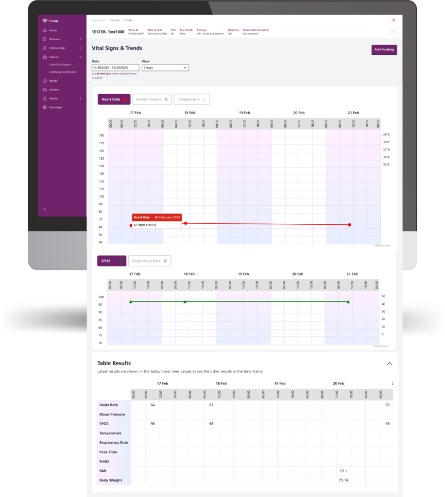
1. Brand Consistency & Visual Hierarchy
The design maintains a strong brand identity by using subtle yet effective purple accents throughout the interface. The purple left-side navigation and buttons reinforce brand consistency while keeping the focus on critical medical data. The clean and minimalistic background ensures that the data visualization remains clear and readable.
2. Solving the Challenge of Displaying Multiple Vitals
A major UX challenge was presenting multiple health metrics (Heart Rate, Temperature, Blood Pressure, Respiratory Rate, and SpO2) in a way that is both intuitive and easy to analyze.
✔ Solution: The vitals were separated into two distinct sections—one with interactive trend graphs and another in a structured table format. This prevents information overload and makes it easier to track trends over time.
3. Clear Data Differentiation & Color Coding
Each vital sign is represented using a unique color and shape to enhance visual distinction and prevent confusion:
✔ Heart Rate (Red, Circle) – Immediately draws attention for critical monitoring.
✔ SpO2 (Green, Triangle) – Stands out against other vitals, making oxygen saturation easily identifiable.
✔ Blood Pressure & Respiratory Rate have their own dedicated colors and markers for quick recognition.
This color-coded approach follows UX best practices, ensuring that users can quickly scan and interpret data without additional effort.
4. Flexible Filtering for Better User Control
The date and vital filtering options allow users to customize their view, making it easy to:
✔ Adjust the time range (5-day period view) to analyze trends over a specific duration.
✔ Select specific vitals to focus on, removing unnecessary distractions.
This filtering feature enhances usability, ensuring that clinicians and healthcare professionals can efficiently retrieve and compare patient vitals.
5. Organized & Readable Table Results
Below the charts, the Table Results section provides a clear, structured view of all recorded values in an easy-to-read format.
✔ Data is ordered by date, making it simple to track changes over time.
✔ Hover interactions allow for additional insights without cluttering the UI.
✔ Consistent spacing and alignment improve readability, ensuring healthcare providers can make informed decisions at a glance.
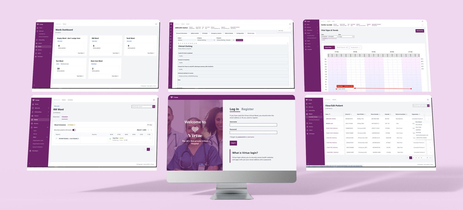
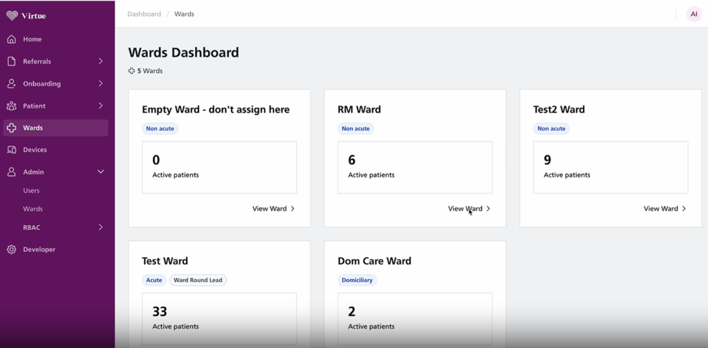
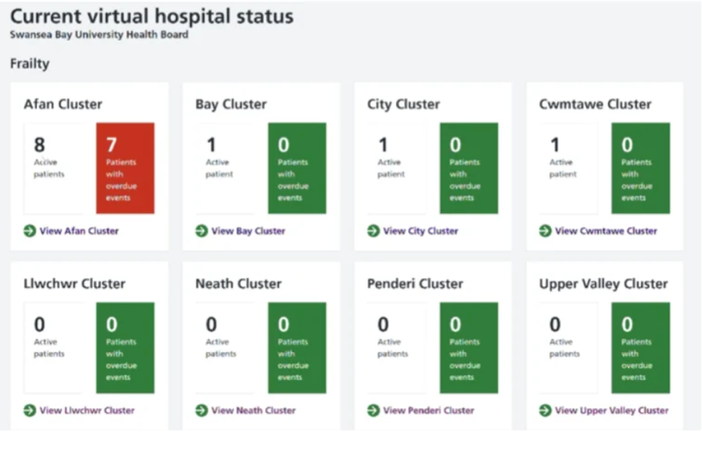
The Virtue Medical Platform involved screens such as Login/Register, Wards Dashboard, View Edit Patient pages, Vital Signs, Adding Templated Clinical notes, Care schedule and so on.
Old vs New screens

Clean, easy to read, no chucky buttons. Multiple logical actions from one place as a central hub .
Chunky repetitive buttons, confusing labels and icons, not natural flow, overcomplicated and longer flow.
Clean, easy to read, no chucky buttons. Multiple logical actions from one place as a central hub .
Chunky repetitive buttons, confusing labels and icons, not natural flow, overcomplicated and longer flow.
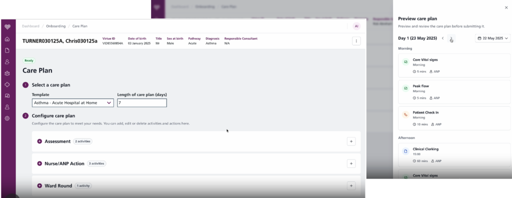
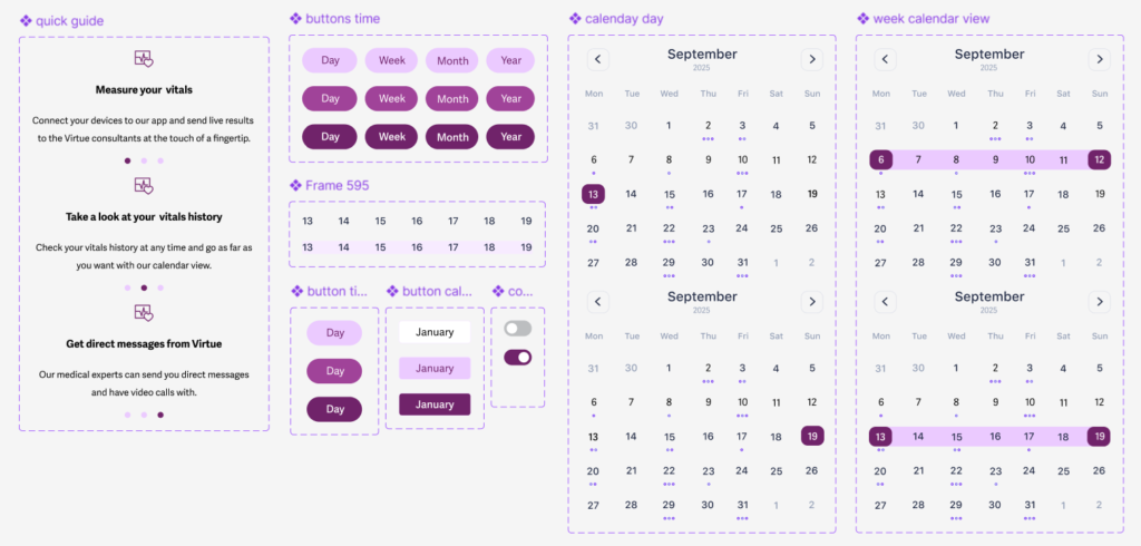
Easy to use care plan with a calendar day view approach for a better view and understanding of the care plan.
Easy to use care plan with a calendar day view approach for a better view and understanding of the care plan.
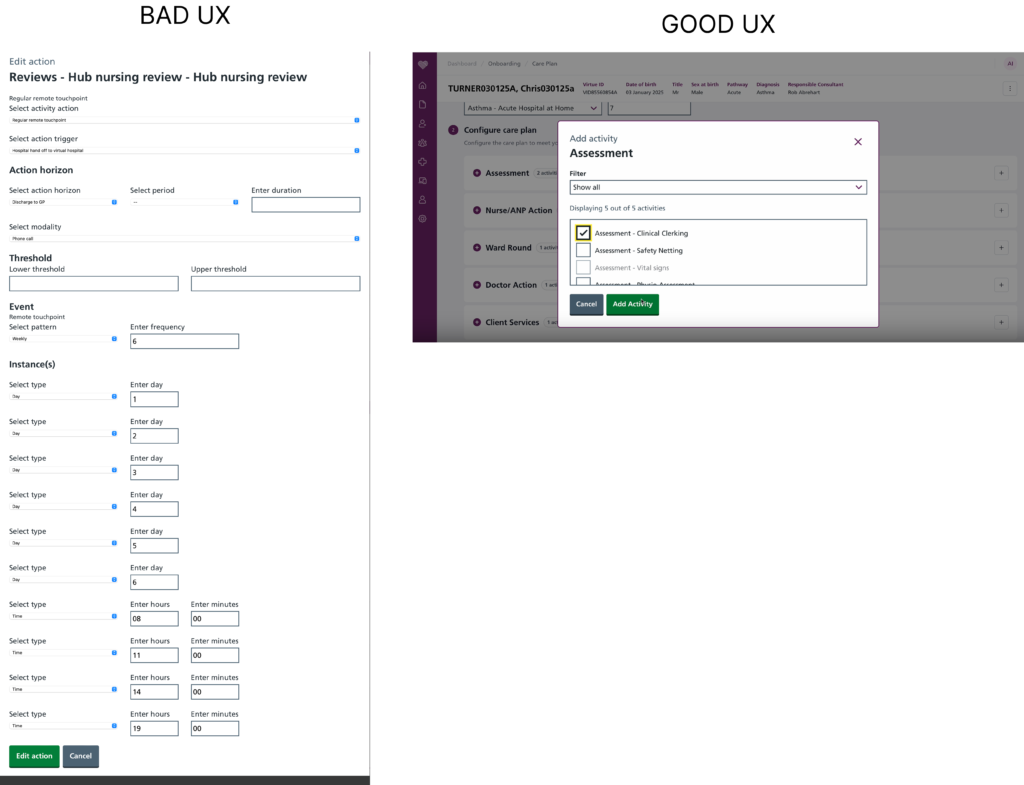
Care Plan- adding task
At a first glance you can already tell how overwhelming and complicated and long the original concept was.
So many manual options, so many drop downs, so many choices and manual labour needed to be done to comlete the action.
What we did now.
We designed the Care Plan screen with a visual-first, interaction-friendly approach to reduce user effort and cognitive load—especially when managing repetitive clinical tasks like assessments or ward rounds.
Based on the type of task added to the care plan ( assessment, ward round and so on) you have already prepped in the background a plan of events, which you will be able to see in preview and change if needed by dragging the task to a different time in the day.
Preconfigured Task Scheduling
Based on the type of task added (e.g., assessments, ward rounds), the system automatically generates a suggested schedule in the background. This provides a ready-made care plan structure that users can:
Preview at a glance
Modify easily by dragging and dropping tasks into new time slots within the day
This approach:
Reduces repetitive manual scheduling
Helps clinicians avoid duplicating the same steps for similar tasks
Provides intelligent defaults while preserving user flexibility
Time Segmentation for Clarity
To minimize scrolling and cognitive overwhelm, we’ve broken the day into five intuitive segments:
Early Morning
Late Morning
Afternoon
Evening
Anytime
This chunking provides:
A clear mental model for when tasks should occur
A logical grouping that aligns with real-world clinical routines
A simplified interface for scheduling and reviewing care tasks
User-Centered Benefits
Less overwhelming: Users aren’t presented with long lists or complex schedules all at once.
More visual: A timeline-like layout helps users understand timing and task flow at a glance.
More efficient: Frequent tasks like assessments are easier to manage without starting from scratch each time.
Drag-and-drop flexibility: Supports natural interaction for rearranging tasks without complex editing.
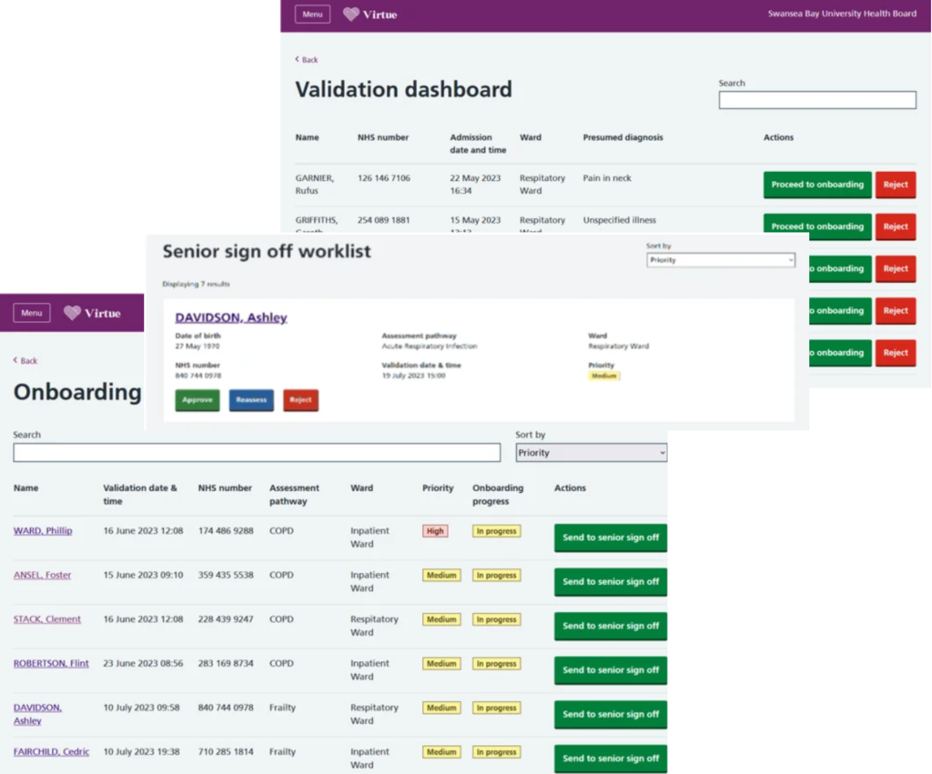
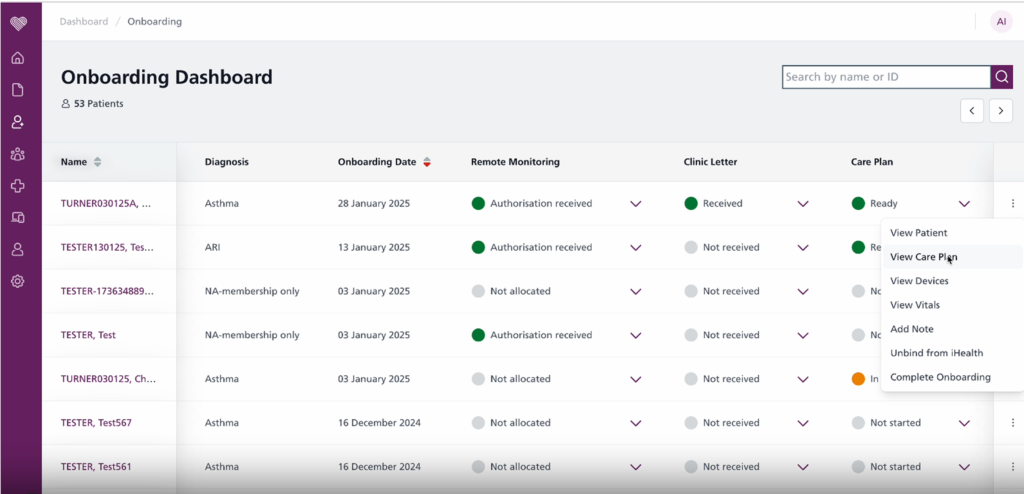
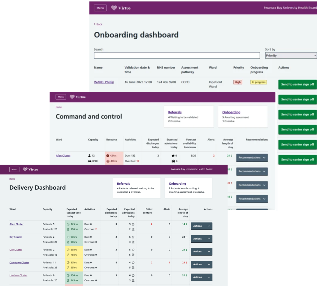
Onboard Add Patient journey
Since the Virtue Health platform is clinician-facing, the onboarding process must be optimized for efficiency, accuracy, and seamless integration into their workflow. Clinicians are often time-constrained and require a system that minimizes manual input, reduces cognitive load, and enhances usability.
A successful UX/UI design for patient onboarding on Virtue Health should be clear, accessible, secure, and user-friendly, reducing friction while ensuring accurate medical data collection.
Story:
✅ Goal: Clinicians need a structured process to onboard patients quickly without missing critical data.
✅ Solution: Implement a linear, guided onboarding flow with clear sections.
Final UX/UI Enhancements for Clinician Onboarding
✔ Visual Hierarchy – Place most critical patient data upfront for fast scanning.
✔ Mobile-Friendly Design – Ensure usability on tablets & smaller screens for hospital settings.
✔ Fast & efficient – Minimize data entry with automation & smart defaults.
✔ Error-proof – Ensure accuracy with real-time validation & change tracking.
✔ Seamlessly integrated – Work smoothly with existing hospital/EHR systems.
Outcome:
With these specific UX/UI solutions, Virtue Health’s patient onboarding process will be faster, more intuitive, and error-proof, allowing clinicians to focus on patient care instead of data entry.
Process & Practices
User Research & Workflow Analysis
- Conduct interviews with clinicians to understand their biggest pain points.
- Observe how they currently onboard patients and document inefficiencies.
- Benchmark against existing clinical platforms for best practices.
Developer Handoff & Implementation
- Ensure design-to-development consistency through detailed Figma files and UI specifications.
- Work closely with developers to integrate EHR, patient databases, and automation features.
Usability Testing & Refinement
- Conduct usability testing with doctors, nurses, and administrative staff.
- Optimize layouts, form structures, and keyboard shortcuts based on feedback.
Challenges & Solutions
1. Speed & Efficiency: Minimizing Data Entry Time
Challenge: Clinicians have limited time to onboard patients, and excessive form-filling slows down workflows.
Solution:
- Auto-Fill & Smart Defaults: Pre-populate known patient data (e.g., NHS Number, DOB, medical history) from integrated EHR systems.
- Quick Actions & Templates: Provide predefined data templates for common conditions or care pathways.
- Keyboard Navigation & Shortcuts: Allow clinicians to tab through fields quickly without using a mouse.
2. Accuracy & Error Reduction in Medical Data
Challenge: Incorrect patient data can lead to misdiagnosis or treatment delays, so error handling is crucial.
✅ Problem: Incorrect, missing, or inconsistent data can delay onboarding and lead to medical errors.
✅ Solution:
- Real-Time Validation & Alerts: Flag missing or incorrect inputs immediately (e.g., invalid NHS number). Highlight missing or incorrect fields with red borders & tooltips explaining the issue.
- Autocomplete & Predictive Inputs: Reduce typing errors by suggesting common medications, conditions, and clinician names.
- Change Logs & Version History: Allow tracking of who edited what and when to ensure accountability.
- Pre-format inputs (e.g., date fields:
DD/MM/YYYY, phone number:+44format). - Auto-save functionality so data isn’t lost if a session times out.
3. Clear Information Hierarchy & Readability
Challenge: Clinicians need to quickly scan patient details, so cluttered UIs slow them down.
Solution:
- Segmented UI with Progressive Disclosure: Show only the most critical patient data first, with expandable sections for additional details.
- Consistent Layout & Standardized Fields: Use uniform form structures to prevent confusion.
- Color Coding & Icons: Highlight important information (e.g., urgent cases in red, completed sections in green)
4. Progress Indicators for Clarity & Efficiency
✅ Problem: Without a clear sense of progress, clinicians may feel unsure how many steps remain or if they’ve missed something.
✅ Solution: Use a multi-step progress bar to indicate:
- Current step in the process.
- Remaining steps left.
- Completed steps visually marked (e.g., ✅ or color change).
🎯 Best UX Practice: Ensure each step is clearly labeled (e.g., “Patient Info,” “Medical History,” “Care Plan”) to prevent confusion.
5. Error Handling & Data Validation
✅ Problem: Incorrect, missing, or inconsistent data can delay onboarding and lead to medical errors.
✅ Solution: Implement real-time validation and inline error messages:
- Highlight missing or incorrect fields with red borders & tooltips explaining the issue.
- Pre-format inputs (e.g., date fields:
DD/MM/YYYY, phone number:+44format). - Auto-save functionality so data isn’t lost if a session times out.
🎯 Best UX Practice: Use non-blocking validation (errors should be fixable in real-time, rather than forcing the user to redo a step).
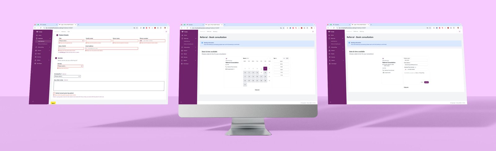
Referral & Booking Screens
Key UX/UI Best Practices Applied
The Referral & Booking screens are designed to streamline the patient referral process and appointment schedulingwhile ensuring a smooth, guided experience for clinicians and patients.
Step-by-Step Referral Process
- Clear input fields with inline validation help users avoid errors (e.g., missing patient details highlighted in red).
- Logical form structure ensures that only relevant fields are displayed, reducing clutter.
- “Next” button guides users through the process instead of overwhelming them with too many fields at once.
- Showing error messages around fields improves UX by providing clear, immediate, and actionable feedback. It prevents confusion, helps users quickly correct mistakes, saves time, and reduces frustration.
Seamless Booking Flow
- Calendar-based scheduling offers a clear, interactive way to select available dates and times.
- Time slot selection is simple, ensuring quick decision-making without unnecessary steps.
- Blue info banner for booking confirmation reassures users they are on the right track.
Final Booking Confirmation Screen
- Summarizes key details (patient info, appointment type, location, and consultant).
- Final “Confirm” button ensures users review everything before submission, reducing errors.
Consistent & Accessible Design
- Purple & white branding maintains visual consistency across the platform.
- Clean layout & large input fields enhance usability for all users, including those on mobile.
Final Thoughts
This design minimizes friction in the referral and booking process by providing a structured, step-by-step flow, ensuring accuracy, efficiency, and ease of use for both clinicians and patients.
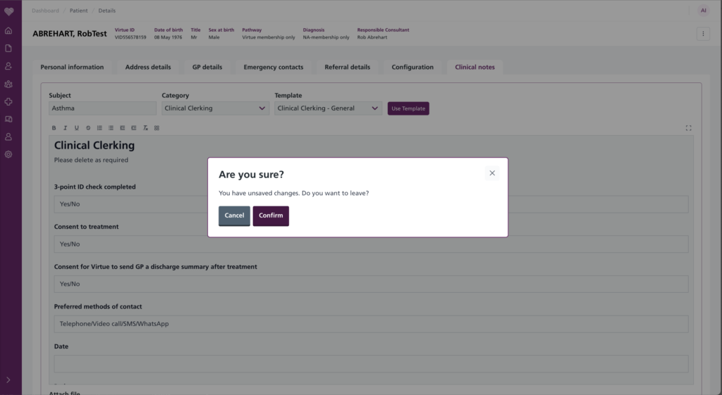
Forgiveness design rule
Designing for forgiveness means creating products that are forgiving of human error. It involves anticipating mistakes users may make and incorporating features that minimize their negative impact. By designing for forgiveness, products can be more user-friendly and ultimately lead to greater user satisfaction.
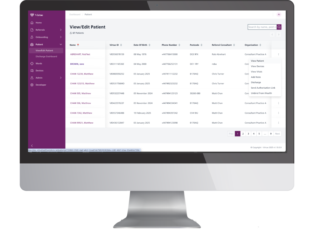
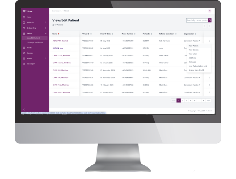
View/Edit Patient
The View/Edit Patient screen is designed for quick patient lookup and efficient data management.
✅ Structured Data Table – Displays key patient details (Name, ID, DOB, Contact, Consultant, Organization) in a clear, organized format.
✅ Search & Filtering – Clinicians can quickly find patients using the search bar (by name, postcode, etc.).
✅ Pagination for Large Datasets – Prevents overload by breaking patient lists into pages for faster navigation.
✅ Action Menu for Quick Edits – Each row includes an options menu for modifying or accessing detailed patient info.
The three-dot menu provides a quick-access dropdown for essential patient actions, improving workflow efficiency.
Key Options & Their UX Benefits
✔ View Patient – Quickly access full patient details for review.
✔ View Devices & Vitals – Provides real-time monitoring data, enabling fast clinical decisions.
✔ Add Note – Allows clinicians to document new observations instantly without navigating away.
✔ Discharge – A clear action for patient discharge management, ensuring proper record updates.
✔ Send Authorization Link – Easily send consent or authorization requests to patients.
✔ Unbind from Health – Provides an option to disconnect a patient from a service or provider if necessary.
Why it’s better:
✔ Reduces navigation time—clinicians can perform actions without leaving the main screen.
✔ Improves efficiency by placing high-priority tasks in an easy-access menu.
✔ Minimizes cognitive load—actions are categorized logically for a clear, intuitive experience.
This smart dropdown integration ensures fast, efficient, and structured patient management, improving overall workflow and user experience.
Fitt's design rule
It is faster to reach bigger targets that are close to you than it is to hit smaller ones that are further from to you
– view your chosen products CTA
– trying to help you go to the next step
Moodboard-Driven UI/UX Research & Design
As part of my design research, I curated a moodboard of reference screens from similar health and productivity apps. These screens helped me:
Identify effective design patterns for usability, clarity, and navigation
Spot visual styles that balance clinical professionalism with approachability
Extract interaction ideas (e.g., drag-and-drop, segmented timelines, clean card layouts)
I used insights from each reference to inform my design decisions—adapting layouts, interaction models, and visual hierarchy to suit the needs of our users while maintaining consistency with Virtue Health’s design language.
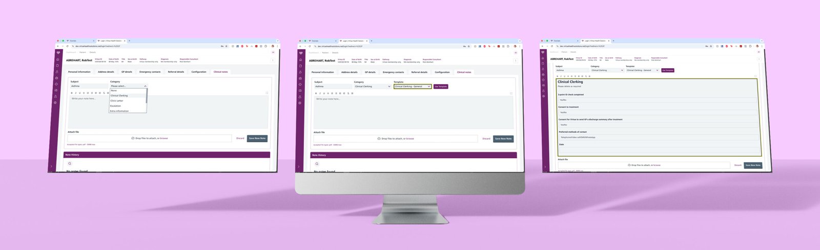
Clinical Notes Screens
Dynamic Step-by-Step Form: Reducing Cognitive Load
✅ Before: Clinicians had to manually fill out a static form, often navigating through unnecessary fields.
✅ After: The form adapts dynamically—as a clinician selects a Subject (e.g., Asthma), the next relevant sections automatically open based on the selection.
🎯 Why it’s better:
✔ Reduces clutter by only showing relevant fields.
✔ Guides the clinician naturally through the process.
✔ Eliminates unnecessary scrolling & manual input.
Smart Categorization for a Faster Workflow
✅ After selecting a Subject (e.g., Asthma), clinicians are presented with a Category selection (e.g., Clinical Clerking, Clinic Letter, Isolation).
✅ Once a category is selected, the system auto-suggests a relevant Template, pre-filling key details to reduce repetitive typing.
🎯 Why it’s better:
✔ Minimizes manual input by pulling structured data.
✔ Ensures consistency in medical documentation.
✔ Speeds up note-taking, allowing clinicians to focus on patient care.
Pre-Formatted Templates for Consistency & Accuracy
✅ Once the Template is selected, the form auto-populates with a structured medical template, including mandatory fields such as:
- 3-Point ID Check
- Consent to Treatment
- Preferred Contact Method
✅ Clinicians only need to review & modify the pre-filled information, ensuring quick documentation while maintaining standardization.
🎯 Why it’s better:
✔ Prevents missing critical details by enforcing structured input.
✔ Standardizes documentation across all clinicians.
✔ Reduces decision fatigue—the system guides users rather than making them figure out the structure.
Attachment & File Upload System
✅ Clinicians can easily attach supporting documents using a drag-and-drop file upload feature.
✅ Supported file types and size limits are clearly indicated to prevent errors.
🎯 Why it’s better:
✔ Speeds up the process—no need to manually search for files.
✔ Ensures compliance by allowing file attachments (e.g., lab results, prescriptions).
Streamlined Note History for Quick Reference
✅ The Note History panel at the bottom logs all past clinical notes, making it easy for clinicians to:
- Quickly review previous entries without opening another tab.
- Maintain version control over patient records.
🎯 Why it’s better:
✔ Reduces the need to search for previous notes.
✔ Ensures continuity in patient care by providing quick access to historical data.
Final UX/UI Benefits:
✅ Step-by-step guidance ensures intuitive documentation.
✅ Dynamic fields reduce cognitive overload & increase efficiency.
✅ Pre-set templates save time & maintain consistency.
✅ Streamlined note history enables quick access to past records.
This redesign significantly improves clinician workflow, allowing for faster, more accurate, and structured documentation, ultimately leading to better patient care.
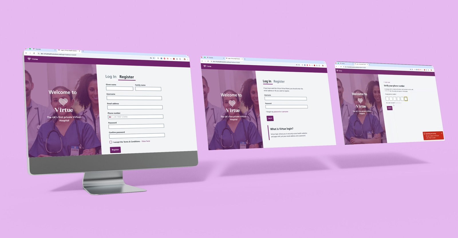
Login & Registration Screens
Key UX/UI Best Practices Applied
Clear & Simple Registration Process
- Minimal fields to reduce friction and speed up sign-up.
- Inline field validation helps users enter information correctly in real-time.
- Terms & Conditions checkbox ensures compliance and transparency.
Effortless Login Experience
- Straightforward username & password fields for a smooth return experience.
- “Forgot Password” & “Forgot Username” links for easy account recovery.
- Brief explanation of login purpose helps first-time users understand its function.
Secure Multi-Factor Authentication (MFA)
- Phone number verification via OTP (One-Time Passcode) enhances security.
- Clear input boxes with automatic focus for a fast verification process.
- Error handling messages guide users if they enter an incorrect code.
Consistent Branding & Accessibility
- Virtue Health color scheme (purple & white) maintains brand trust.
- Legible fonts, high contrast, and properly spaced elements ensure readability.
- Mobile-friendly layout supports both desktop & mobile logins.
Final Thoughts
This design prioritizes security, ease of use, and accessibility, ensuring that users can register, log in, and verify their accounts with minimal effort while maintaining a polished, professional brand experience.
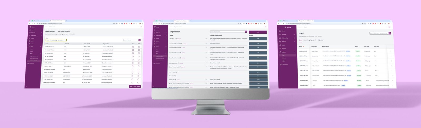
UX/UI Breakdown of the Admin Screens
The Admin Panel in Virtue Health is designed for efficient user, patient, and organization management, ensuring quick access, clear role assignments, and structured data handling.
User Access & Permissions Management
- Grant Access Screen: Admins can assign user access to patients by searching names or Virtue IDs, with checkboxes for permissions (Head, Write Access) and a one-click confirmation button.
- Users List: Displays status, last login, and roles for easy account monitoring and verification.
Organization Linking & Role Assignment
- Search & Link Functionality: Admins can find organizations and assign user roles with a structured list and clear “Link” buttons for quick associations.
- Expandable Sections: Keeps the interface clean while allowing admins to view detailed organization data only when needed.
Efficient Search & Filtering
- Search bars on all screens allow for quick lookups by name, email, or ID, reducing admin workload.
- Pagination for large datasets prevents overload and improves loading speed.
Consistent & Accessible UI
- Uses Virtue Health’s branding (purple & white) for a professional, unified experience.
- Table-based layout ensures quick scanning and structured data management.
Final Thoughts
The Admin Panel is designed for speed, efficiency, and role-based management, enabling smooth user onboarding, access control, and organization linking while maintaining a clean and structured interface.
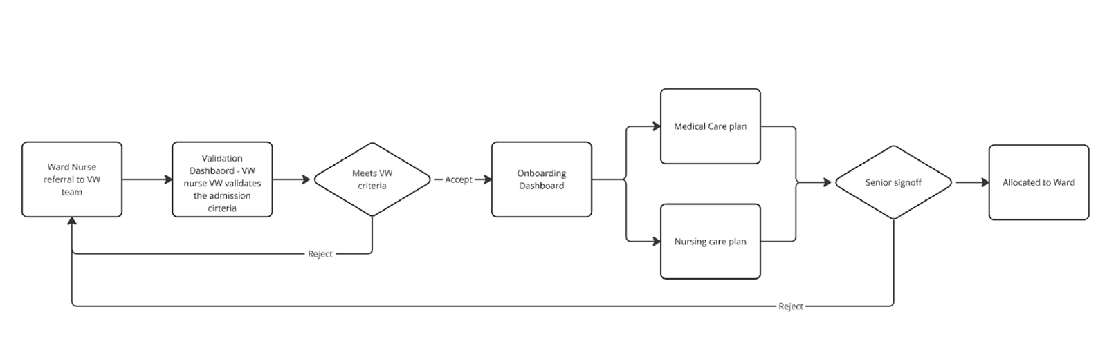
Patient journey with the Virtue Health services
This patient journey was designed in close collaboration with medical consultants to ensure a seamless, effective process that aligns with both clinicians workflows and patients needs.
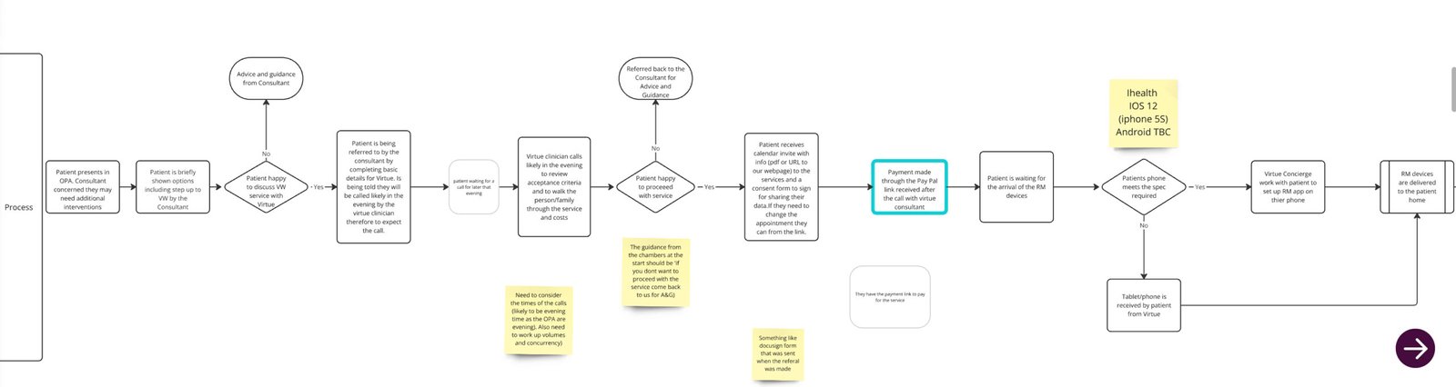
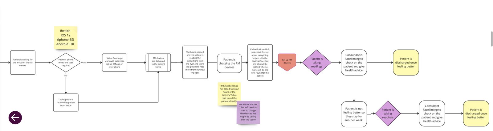
High Level Workflow
Video walk-through of other screens
Create a Care Plan
Schedule a Patient Call & Referral Screen
Patient details screen & Onboarding Dashboard
Virtual Wards & Patient Schedule
Virtue Health App
About
This app is a medical monitoring platform designed to connect patients with up to six medical devices, depending on their care plan. It prioritizes ease of use, especially for middle-aged and older users, ensuring intuitive navigation and clear health insights.
Key Features (Basic Version)
- Device Connectivity: Users can connect medical devices and take real-time measurements.
- Health History & Search: Easily search and filter past readings by day, week, month, or year.
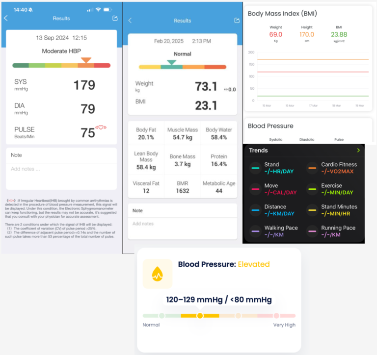
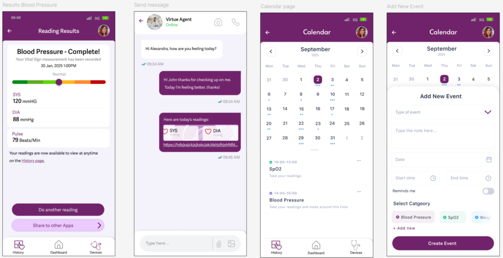
- Visual Health Indicators: Each reading has a color-coded result (green, orange, red) for a quick visual cue—making it simple to assess health at a glance.
- Consultant Messaging: Receive messages from medical consultants for guidance and health updates.
- Results & Insights: View structured health data from readings, offering easy interpretation.
- Biometric Login: After registration, users can log in with biometrics for faster and easier access.
Upcoming Enhancements (Making It More Advanced)
- Notifications: Alerts for new readings, messages, or important health updates.
- Video Calls: Direct communication with consultants for remote health support.
- Medicine Reminders: Personalized notifications for taking medications on time.
This app is designed with sick and older users in mind, ensuring simplicity, clarity, and accessibility, while also allowing for more advanced features as their needs grow.
A key aspect of the design is color consistency—the colors used for vital sign readings match those on the clinicians’ platform, providing a seamless and intuitive experience for both patients and healthcare professionals.
Key UX Steps:
Creating a user-centered app requires a structured UX process to ensure usability, accessibility, and efficiency.
- Benchmarking similar apps
- User Research – We conducted some user interviews to understand their needs, pain points, and workflows. Due to minimal budged it was very hard to manage this part so I had to do a lot of the UX practices on myself and friends.
- User Personas
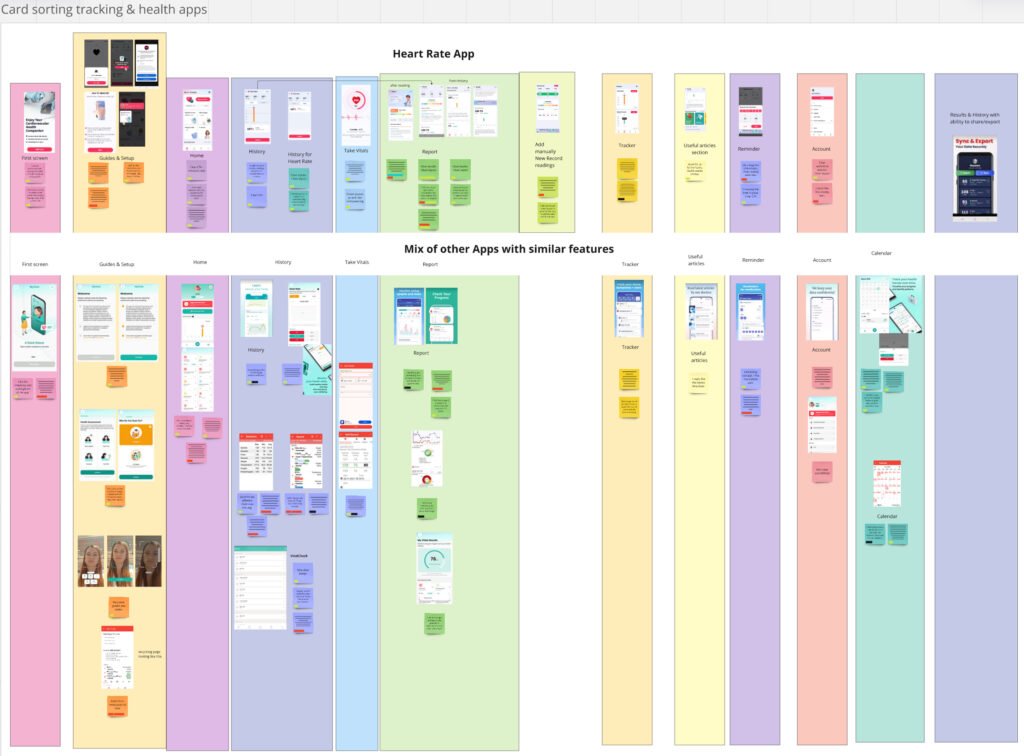
- Card Sorting – As seen in our card sorting exercise, we grouped app features (e.g., vitals tracking, history, reports, reminders) to create a logical and intuitive navigation system.
- User Journeys & Flows – We mapped out different user journeys, ensuring a smooth experience from setup to daily health tracking.
- Wireframing & Prototyping – Based on insights, we created wireframes and prototypes for testing and iteration.
- Usability Testing – We are now testing the app with real users to validate its design and functionality before launch.
Each step ensures the app remains intuitive and effective, especially for middle-aged to older users managing chronic conditions.
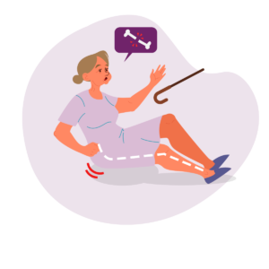
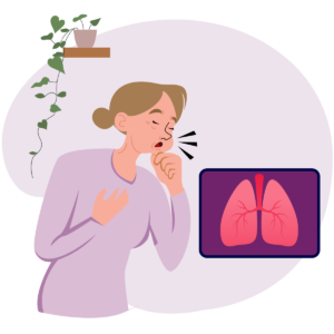
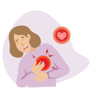
This app is currently in the testing phase and will be published soon on the market. We are testing it with people who have medical conditions such as respiratory conditions (e.g., asthma), heart conditions, and frailty, ensuring it meets their needs effectively. Additionally, we are working closely with our clinicians to validate the platform from a medical perspective and ensure accuracy in health monitoring.
User Persona A
User Persona B
Research-Informed Design
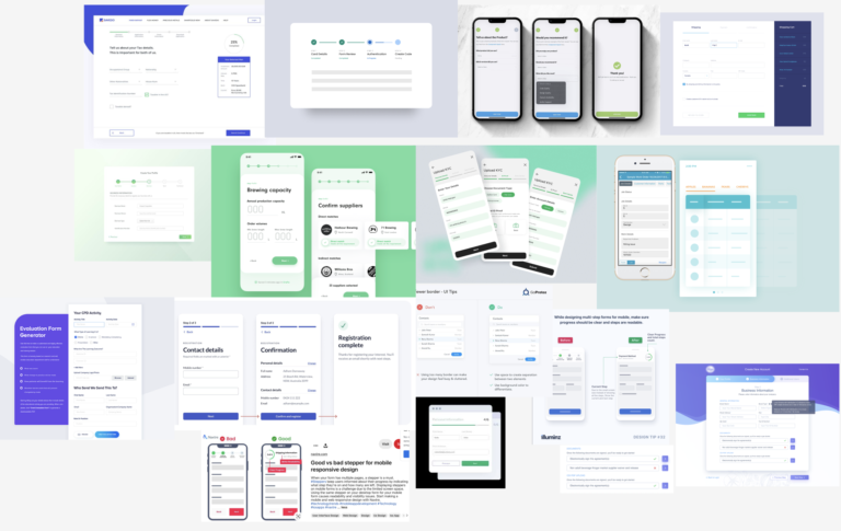
Before diving into the design phase, I conducted extensive research into existing digital health apps and stepper-based workflows. I drew particular inspiration from iHealth, a leading app in personal health monitoring, known for its clean UI, structured data flow, and effective use of visual hierarchy for health vitals.
To ensure the app I designed would feel intuitive, trustworthy, and accessible, I studied a variety of mobile patterns including:
Form stepper flows for guided processes (as seen in evaluation tools, onboarding flows, and survey builders).
Health dashboards and device integration UIs for efficient user interaction.
Filtering and history tracking interfaces commonly used in calendar-based health apps.
By analyzing best practices across these tools, I was able to:
Simplify user flows for registering, syncing devices, and viewing vitals.
Create a clear and empathetic visual language using soft color gradients and strong contrast where needed.
Implement a progressive disclosure of information to avoid overwhelming users, especially older adults.
This foundational research helped shape a user-centered experience that blends clinical accuracy with everyday usability.
Figma UI Library:
I built a scalable, accessible component library in Figma to ensure consistency and speed across the app. Inspired by patterns from iHealth and other health-tech tools, the system includes:
Modular cards, forms, and filters
Responsive auto-layouts and variants
Built-in accessibility and error states
This setup made it easy to design, test, and hand off clean, reusable UI across the product.
App user flows:
I designed a comprehensive app flow for a patient-facing healthcare application inspired by the iHealth app, with a particular focus on streamlining the user experience while ensuring data integrity and security. Here’s a breakdown of my work:
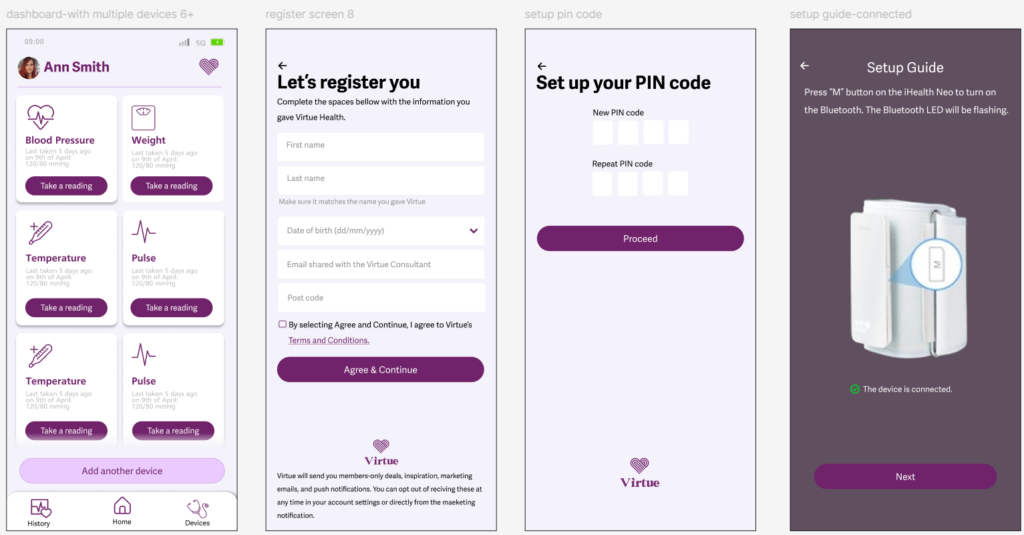
1. Registration & First-Time User Flow
Eligibility Gatekeeping: I implemented a clear condition—only patients already enrolled in Virtue can register or log in. This ensures platform security and prevents unauthorized access.
Smart Data Handling: The registration flow avoids asking users for information that the system already has, reducing friction and enhancing the user experience.
Onboarding Focus: I created a tailored first-time user flow, which includes device setup, notification preferences, and privacy consents—essential steps for onboarding users in a health app.
2. General App Flow
After initial onboarding, I developed a general user flow that includes:
Syncing and recording vitals via integrated devices
Communication with health consultants or virtual agents
Real-time monitoring and reminders
Dashboard access to view vitals history and communication logs
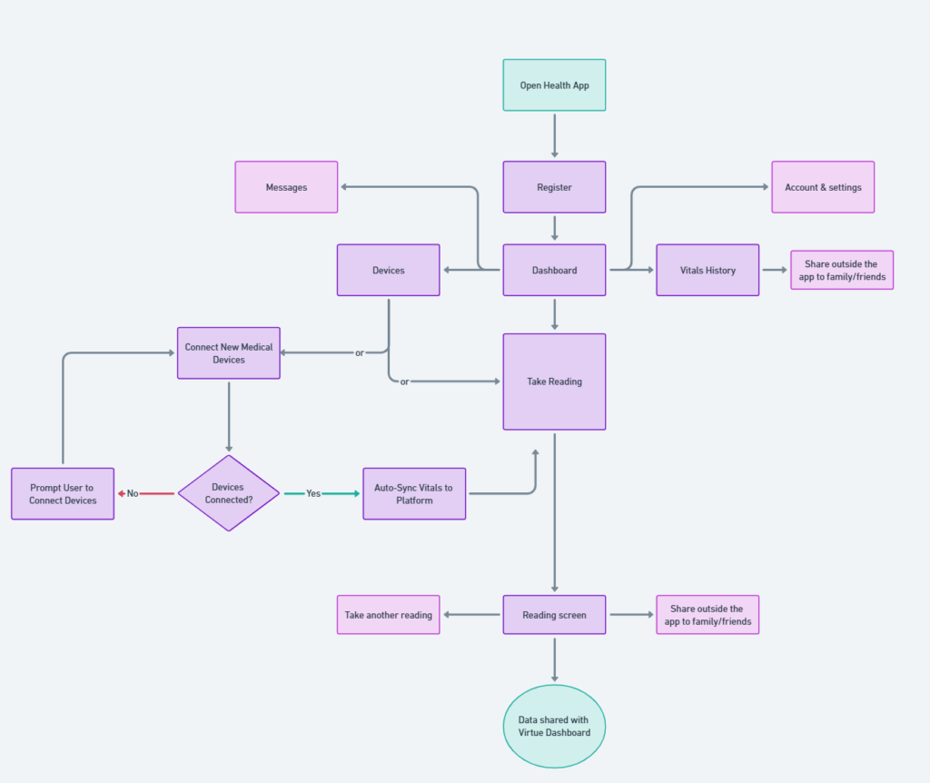
Design Approach & Impact
My design reflects a principled approach: reducing cognitive load for users, aligning with healthcare compliance, and maintaining usability.
By modularizing the flow into registration/onboarding vs. general use, I created a scalable structure that can evolve with additional features or new user roles (e.g. caregivers or providers).
Updated screens
Virtue Health Website
New website design will be LIVE soon! For now only the new tutorials page is available.
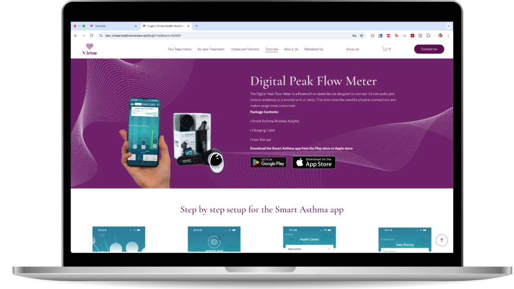
Tutorials page
The Virtue Health Tutorials Page is designed to provide a seamless, intuitive, and user-friendly experience for patients who need guidance on setting up their medical devices and using the Virtue Health app.
Key UX/UI Best Practices Applied
✔ Clear Navigation & Quick Access:
- Logical content structure with step-by-step guidance.
- CTA buttons that sends you to specific section s on the page (“Device Setup” & “App Setup”) for instant access.
- Multiple entry points: via website or QR code in device packaging.
✔ Brand Consistency & Accessibility:
- Virtue Health’s color palette (purple & white) ensures a cohesive, professional look.
- Legible fonts, high contrast, and spaced-out elements enhance readability.
- WCAG-compliant for inclusivity, especially for elderly and non-tech-savvy users.
✔ Intuitive, Mobile-Friendly Layout:
- Minimal cognitive load with clear sections & structured hierarchy.
- Large, touch-friendly buttons for easy smartphone navigation.
- Fast-loading, responsive design for on-the-go accessibility.
Final Thoughts
A well-structured, patient-friendly page that ensures quick, frustration-free device and app setup, improving independence and ease of use.
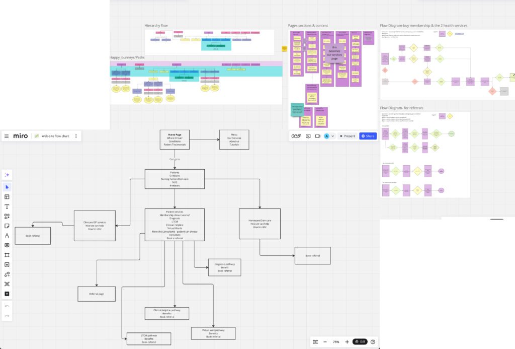
Website Flow Chart & Content Strategy for Redesign
New website design will be LIVE soon!
This website flow chart and content structure was developed as part of the redesign process to create a more user-friendly and intuitive experience.
Challenges & Approach
The original website contained excessive content, making navigation overwhelming and inefficient. To improve usability, we:
✔ Refined Content – Reduced unnecessary text and focused on key information that aligns with the needs of the three primary user groups:
- Patients: Clear presentation of services, membership options, conditions treated, and an easy referral process.
- Consultants: Emphasizing the benefits of working with Virtue Health for both clinicians and their patients, with a streamlined referral system.
- Domiciliary Care Partners: Highlighting how we can support their work, along with an easily accessible referral process.
✔ Designed User-Centric Flows – Created three distinct user journeys, ensuring that each audience quickly finds relevant information without information overload.
Balancing UX Best Practices & Business Requirements
- While UX best practices prioritize clarity, simplicity, and usability, there were instances where the business owner preferred a more content-heavy approach. We worked to find a middle ground, ensuring that essential UX principleswere maintained while accommodating business needs where necessary.
- This structured approach ensures that the redesigned website provides clear navigation, quick access to critical information, and an optimized experience for all users.
- In instances where the owner’s feedback conflicted with established UX/UI best practices, I ultimately had to proceed with certain decisions I did not fully endorse.
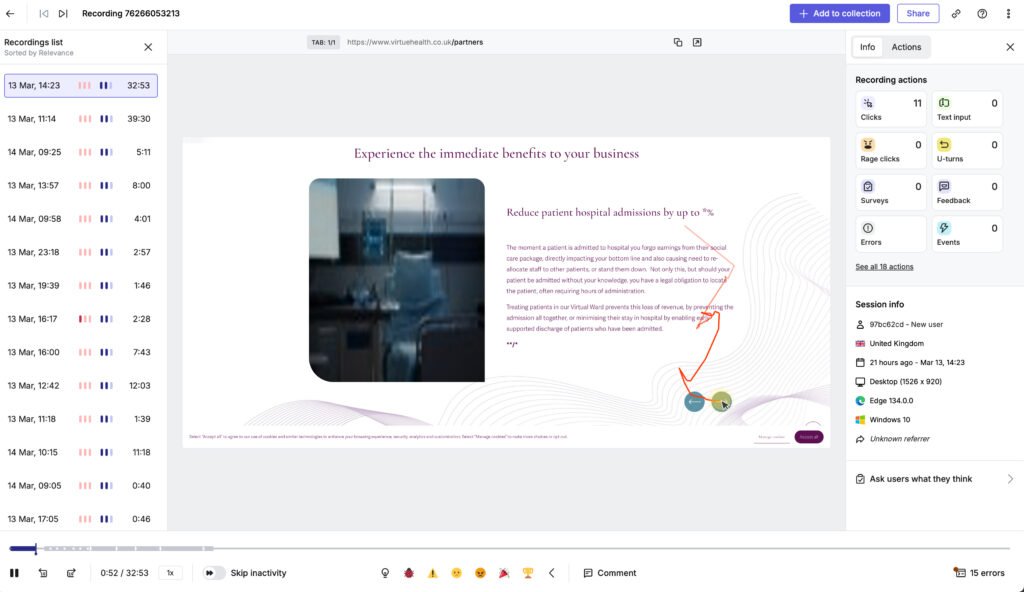
Why I use Hotjar
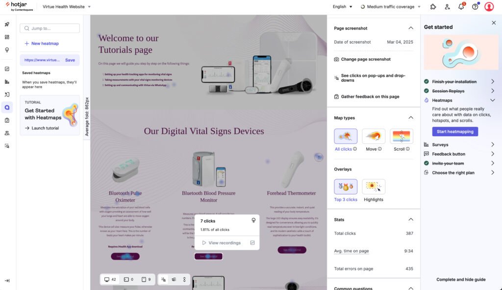
All Clicks view
I used Hotjar’s “All Clicks” view on the Tutorials page to gather data-driven insights on user behavior and optimize the user experience. Here’s why:
✅ 1. Identify High-Interest Areas – By analyzing where patients click most, I could determine which tutorials were most relevant and easily accessible vs. which might be overlooked.
✅ 2. Detect Confusion & Friction Points – If users were clicking on non-clickable elements (e.g., static text, headers), it indicated potential UX issues where they expected interactive functionality.
✅ 3. Optimize Layout & Navigation – Understanding click patterns helped in refining button placements, tutorial categorization, and overall page hierarchy to enhance usability.
✅ 4. Improve CTA Effectiveness – By tracking click engagement on buttons and links, I could assess whether calls-to-action (e.g., “Start Tutorial”) were visible and compelling enough.
✅ 5. Validate UX Hypotheses – Hotjar’s data confirmed whether the page design matched patients expectations, allowing for iterative improvements based on real user interactions.
Outcome:
Using Hotjar’s “All Clicks” view, I optimized the Tutorials page to be more intuitive, efficient, and aligned with patient flows, ensuring quick access to critical learning resources without unnecessary friction.
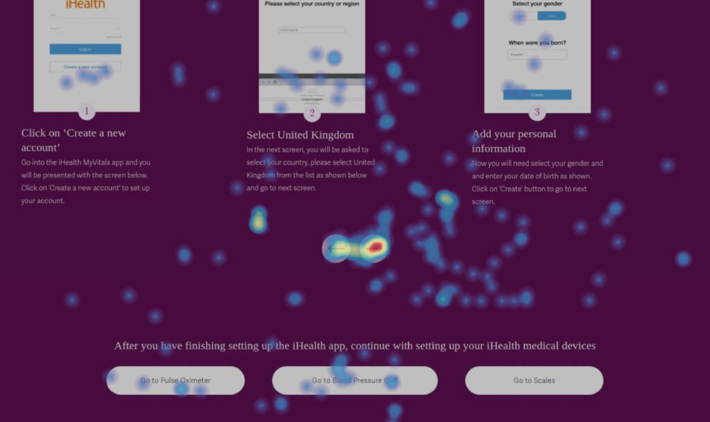
Move view
I used Hotjar’s “Move View” on the Tutorials page to analyze cursor movement patterns and gain insights into patient behavior, engagement, and usability issues. Here’s why:
✅ 1. Identify User Focus Areas – By tracking where patients hovered their cursor, I could determine which tutorial sections were drawing the most attention before they clicked.
✅ 2. Detect Hesitation & Cognitive Load – If users hovered over certain areas without clicking, it indicated potential confusion, unclear instructions, or decision fatigue.
✅ 3. Optimize Information Placement – Cursor movement patterns revealed whether important content (e.g., tutorial titles, instructions, CTA buttons) was in the right place or being ignored.
✅ 4. Improve Click-to-Hover Ratio – A high hover rate without corresponding clicks suggested that users were unsure or hesitant about interacting with certain elements, leading to design refinements for clarity and accessibility.
✅ 5. Validate UX Flow & Intuitiveness – By analyzing how patients navigated the page, I could confirm whether the page structure guided them naturally or if adjustments were needed.
Outcome:
Using Hotjar’s “Move View”, I identified key areas for improvement in layout, CTA visibility, and content clarity, ensuring that the Tutorials page effectively guided patients to the resources they needed without confusion or hesitation.
Session replay
I used Hotjar’s Session Replay on the Tutorials page to observe real patient interactions and uncover usability issues that impact engagement and comprehension. Here’s why:
✅ 1. Understand Real User Behavior – Watching actual patient interactions helped me see how they navigate the tutorials page, what they engage with, and where they struggle.
✅ 2. Identify Friction Points & Confusion – If patients hesitated, clicked repeatedly, or abandoned the page, it signaled confusing UI elements, unclear instructions, or poor content placement.
✅ 3. Track Interaction Patterns – Observing where patients scroll, pause, or drop off helped pinpoint whether tutorials were easily discoverable and accessible.
✅ 4. Optimize Navigation & CTA Visibility – If patients struggled to find the right tutorial or didn’t click “Start Tutorial”, it indicated the need for better button placement or clearer guidance.
✅ 5. Validate UX Design Improvements – After making changes, I reviewed new session replays to confirm if adjustments improved usability, ensuring a smoother tutorial experience.
Outcome:
Using Hotjar’s Session Replay, I gained deep insights into real patient behavior, allowing me to fine-tune the tutorials page for better navigation, engagement, and ease of learning.
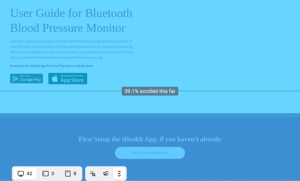
Scroll view
I used Hotjar’s “Scroll View” on the Tutorials page to analyze how far patients scrolled, identify drop-off points, and optimize content placement. Here’s why:
✅ 1. Identify Drop-Off Points – By tracking where patients stopped scrolling, I could determine if key tutorial content was being seen or ignored.
✅ 2. Optimize Content Placement – If patients weren’t scrolling far enough, I repositioned important tutorials and CTAs (e.g., “Start Tutorial”) higher on the page to increase engagement.
✅ 3. Improve Readability & Engagement – If patients scrolled quickly without stopping, it indicated skimming behavior, suggesting the need for clearer section breaks, visuals, or condensed information.
✅ 4. Ensure Key Tutorials Are Seen – If critical content was below the average fold, I adjusted the page structure to ensure the most important tutorials were seen earlier.
✅ 5. Validate UX Flow & Attention Distribution – By analyzing scroll behavior, I confirmed whether the page guided patients naturally or if important sections needed repositioning for better engagement.
Outcome:
Using Hotjar’s “Scroll View”, I optimized content hierarchy and CTA placement, ensuring that patients saw and engaged with essential tutorials, reducing frustration and improving onboarding efficiency.
Print & Packaging design
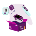
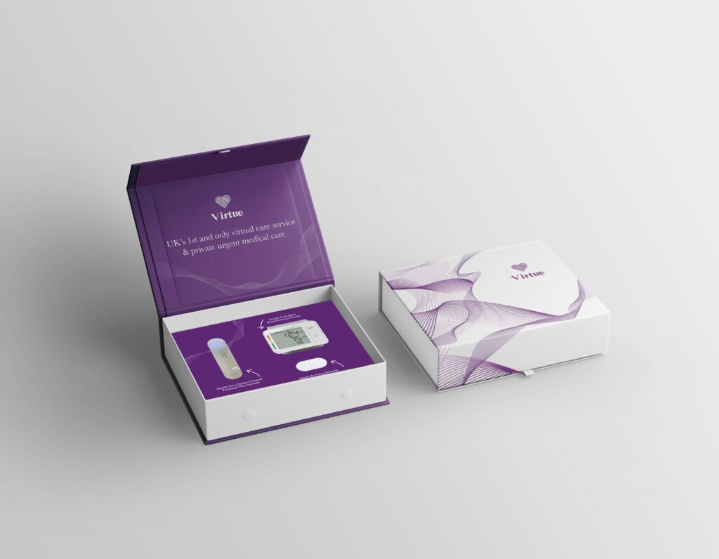
Box design
I spearheaded the end-to-end design and production of Virtue Health’s medical device packaging, ensuring a modern, high-quality presentation that effectively showcased all three devices while maintaining a strong brand identity. This project required meticulous attention to detail, as the owner had specific requirements for how the box should open and function. I conducted precise measurements and structural planning to create a design that was both practical and visually compelling.
Beyond the design phase, I led vendor sourcing and negotiation, securing a 50% cost reduction along with free delivery—a significant win for the company. The final packaging solution not only met aesthetic and functional expectations but also reinforced Virtue Health’s commitment to innovation and excellence. The company was highly satisfied with the outcome, as the packaging elevated the product’s perceived value while optimizing production costs.
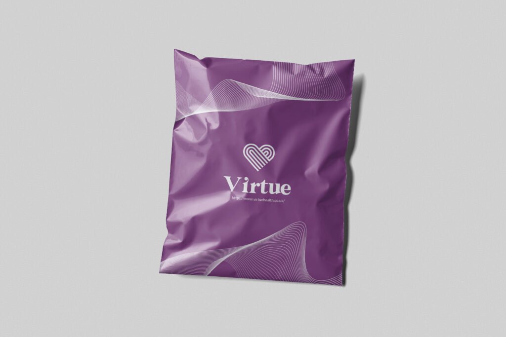
Mailing bag design
I led the sourcing and procurement of a high-quality, cost-effective bag solution to securely package and deliver Virtue Health’s new medical devices. The objective was to find a sturdy, well-designed bag that could hold a single medical device, maintain premium quality without excessive cost, and be available in at least two different sizes.
To achieve this, I identified and negotiated with a supplier that could provide custom-branded bags, ensuring they met durability, aesthetic, and budget requirements. Additionally, I successfully secured a deal for a personalized mailing bag, optimizing both cost and logistics. Once the supplier was finalized, I prepared the design, coordinated with the team for approval, and ensured production met our branding standards.
Key Problems Solved:
✔ Eliminates the Need for a New Complex Box Design – With three new devices launching, there wasn’t enough time to create a custom box solution for multiple device combinations (6, 5, or a mix of 1-2).
✔ Faster Time-to-Market – This interim packaging solution allows us to immediately ship devices to patients without delays.
✔ Cost-Efficient & Scalable – Instead of investing in a costly and time-consuming box redesign, this bag solution provides a practical, cost-effective alternative that can scale as needed.
✔ Secure & Professional Packaging – Patients receive their devices in a branded, protective bag, maintaining Virtue Health’s high standards in presentation and customer experience.
This approach provided a smart, flexible, and timely packaging solution while keeping costs under control, allowing Virtue Health to continue operations smoothly as we prepare for future packaging developments.

Social Media Giff's


Illustrations & other brand elements

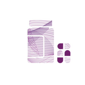


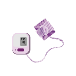


Abstract line Illustrations
Specific to the brand
Illustrations for showing steps & presentations
text